Unknown's avatar

About Cheryl @ Artzzle

I'm a former realtor turned professional stylist - stager, with a college major in art and design. I help people make their homes special places, no matter the size of their budgets or spaces. Arrangement and color, accessories and art, all play a very important part. I design with my clients' tastes in mind, not my own. It's your home and should look like you :) My website, Artzzle shares easy, economical decor and craft ideas, information and projects.

May Day Flowers

Yesterday was the first of May, but this year’s weather has kept most spring blooms away. Growing up, we kids would make all kinds of paper flowers to decorate little May baskets for our friends. After school on May Day, we’d deliver them to the recipient’s front door, ring the bell then run and hide to watch them find the surprise. That was one of my daydream memories as I tried to ward off the depressing reports of more snow to come!

The beauty of flowers is cheering anytime of year. Who doesn’t like to stroll through a gorgeous garden, give or receive a bright bouquet on a dreary winter day. Working as a florist was most enjoyable and gratifying for me. I also appreciate the value of florals in decorating too. Nature is a major inspiration point but when it isn’t offering much color, fabrics are a wonderful stand-in.


The above, modern mix of florals and paisley works for guys and gals. The pattern offers several choices for accents and wall colors. Click on the pic to see the bigger picture.

You can see how helpful a colorful fabric can be. Everything you need for a scheme is within the pattern’s design. All you have to do is find the rest of the pieces and assemble your room’s puzzle.


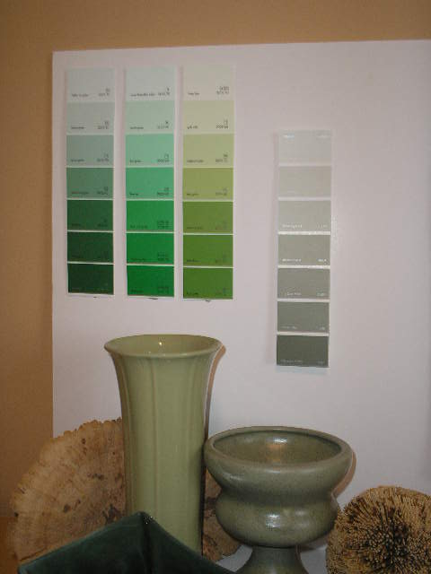
Featured above is a warmer, more traditional design, which once again, offers an abundance of choices to create an entire room scheme. Colors in the bottom paint strip did not photograph well and are actually much warmer.

TIP 1: When you’re tackling an entire room project, you may find easy answers to many questions in a trip to a fabric store. But beware, you may go from “no ideas” to an overload of choices, but you’ll have fun in the process.

TIP 2: While shopping for your main inspiration fabric, don’t forget to find it some friends. Look for a second pattern; possibly drawing on one of the predominant colors from the first; it should still be lively and a bit bold, but don’t out-shine your primary piece.
Then look for your neutrals and textures.

TIP 3: Stores only allow a small size piece when you ask for free cuttings, and it often doesn’t represent the true pattern. If you can afford it, buy a quarter or third yard for your samples. It will give you a much better idea.

Can’t just jump in the car and go? No problem. Check out one of my favorite websites at www.fabric.com. Take some time to look around. You can choose by subject, color, manufacturer, designer and pull up a never-ending source of ideas. They also have a great clearance section with prices grouped at 25% – 50%, 60% off and so on. Many selections also give a panel of coordinate patterns to consider, which may make things easier for beginning decorators. You can make a display wall of several selections to see how you like the combinations, and decent sized samples can be ordered. It’s all at your fingertips.

A popular textile designer to consider is Amy Butler. She’s fun because she offers so many different style formats, from very traditional (grandma’s bedroom wallpaper) to funky, new designs and lots in between for everything else.

I’ve been researching for a “guest room” project where the couple wants a modern, more masculine look. Gray and gold is trending currently, but it is also a very tried and true decor combination, so it will be one of my presentation boards. Below are some fantastic Butler designs I may suggest.

Large_BI-055

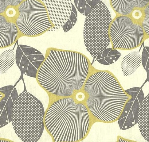
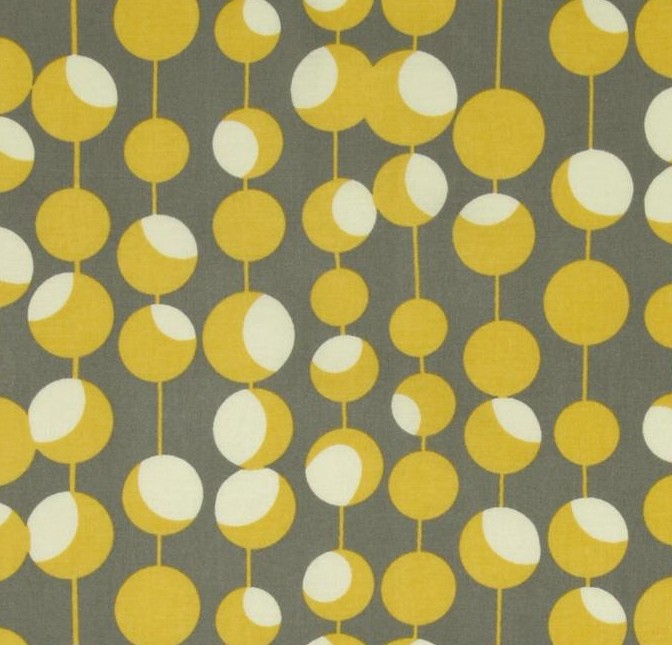
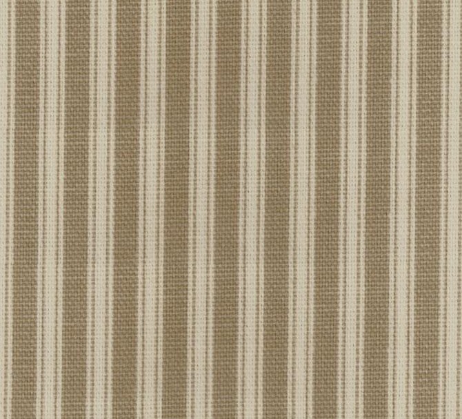
They are not wallpaper people (yet anyway 🙂 ) so the inspiration fabric could be used on a headboard, a chair (if heavy enough) or draperies. The one I call Olives could be on larger pillow shams, dresser covers, a bench top. The neutrals and textures would of course be on smaller toss pillows or throws.

I would use subtle, mid to lighter tints of grays for paint, and a mustardy, yellow gold for accents on this board.

Today’s 3Rule: Keep in mind three elements in design are 1. color, 2. pattern and 3. texture.

Lot’s to think about today, but remember … don’t stress, just start.

Until next time – Cheryl

P.S.
I’m learning lots more about WordPress! How do you like the new look?

New, fun category

Yes, you can decorate without destroying your budget. Proof positive is found in the newest Artzzle post category. It was going to be named “Fun Finds” because I get so much fun and satisfaction in finding cost effective items. But we all want a beautiful home and with budget such an important factor for most of us, hence “Budget Beauties”, to help demonstrate what can be done on a low-zero budget!

OLYMPUS DIGITAL CAMERA

I’ll share recent fun finds, where they were found and what they cost; from one-of-a kind pieces to great items from retail locations. Pictures above feature several great finds.

The petite, solid wood coffee table ($9.99) and the unique, copper serving tray ($0.99) were purchased in recent trips to an area thrift store, Hand-To-Hand Thrift in Pease, Minnesota. The beautiful pillows were brand new items ($4.99) purchased at Discovery Thrift in Milaca, Minnesota. The glassware is part of a 24 pc set (nearly new @ $7.49) also found at Discovery. Finally what I think is a fantastic find, is the VERA scarf for $1.00 from another area thrift store “His Savers”.

Scarves are great “double-duty” items because you can use them decorate your home OR yourself! I cap my scarf budget at $2.50, so if you catch this link VERA NEUMAN, you’ll appreciate my special love of VERA items, especially at that price.

Pictured below, at eleven years they aren’t recent finds, but our boys are certainly on our “most beloved finds” list. Fozzy and Freddy were found in the home of a daughter of one of my co-workers at the time. Litter mates from a small, yellow lab mom and a huge black & white newfoundland dad. Twelve of thirteen pups survived and Fozzy was our first choice. We already had two older dogs at home and wanted to transition a pup in to cushion an upcoming loss. But as we visited each week, my heart ached for Freddy as the runt (with a slightly deformed lower jaw), because no one had claimed him.

I cried about what a shame it was because he was just so darn cute. Hubs gave me a hug and said that we had two training crates at home … so for a short time we had four dogs! Cinnamon, our lovely lab/golden girl left us six months after, and almost a year to the day later, we lost Buddy, our lab/sharpei mix.

When I introduced Artzzle, I told you that home, family, friends and pets were most important to me. I meant it!

Enjoy our finally found Spring and as always … don’t stress, just start!

Show off your Treasures – Starter Steps to Successful Displays

Today let’s look at display so you can show off some of your treasures. I want to attack some of your fears and “I don’t know hows”, answer a few of your questions and “how do I’s” and demonstrate how easy and quick it really can be.

You may have official collections – a group of more than three items, similar in appearance, theme and appeal, purposely acquired. Or you might just have lots of individual things you’ve gotten and kept over time. To make it easy let’s just say you have some interesting stuff but don’t know where to put it or how to arrange it. “Put it” relates more to storage so we’ll skip that and go to the arrange part. In interiors arranging primarily refers to furniture and big items. Arranging your treasures is simple display and whether you think so or not, display is simple and fun, so don’t fret.

OLYMPUS DIGITAL CAMERA

Most of us aren’t fond of rules, at least not a long list of them all at once. Any area of design does have rules, but try to think of them more as steps, stairs that you can use or skip as you choose.

Before you start this climb, let’s shorten the stairway. Take a thorough look around the space. Besides furnishings, are there lots of other items gathered? Is stuff everywhere or a few things here and there? Display = organized grouping. Clutter = unorganized masses. This article isn’t about cleaning clutter or storing it, so don’t go there. Just straighten up a bit. If there are piles and crowded shelves, for now just get a box or two for everything and clear the space up a bit.

OLYMPUS DIGITAL CAMERA

1. Pick a Place. Where do you want to show off your display; on a shelf, table, desk, countertop? The space you use helps you choose appropriate items for your grouping. Keep the space in mind as you continue.
2. Concentrate on some of your favorite pieces; not just what you want to show others but items you, as the daily viewer, will enjoy. 3 Rule. Look for 3 pieces in 3 different heights; consider varied textures and colors, but the combination should be compatible.

My Magic Number is THREE and three of my favorite (and most used) words are DIFFERENT, VARIED, and ADVENTURE. Three is a most useful number in design and display as you’ll soon see, but I apply it to nearly everything else as well. Different is just amazing, pure and simple. Most people strive to be unique, different from anyone else. We enjoy many different things. There should always be a different way to look at it. Variation is vital in both life and design. It creates intrigue, interest and texture, and when well balanced, it coordinates, communicates and completes any task or situation comfortably.  And who doesn’t crave adventure?!?

OLYMPUS DIGITAL CAMERA

OLYMPUS DIGITAL CAMERA

EXAMPLE: In the photos I chose a shelf on a vertical unit and gathered some favorite items. START WITH THREE VARIED PIECES. I started with the orange ceramic piece at medium height, next a tall greenish vase and last a much shorter brown piece. EVALUATE. I didn’t like the two round pieces together in a small group so switched the smallest for a rectangular item at the same height. This is fine as is, but I wanted some BACKGROUND so added the plate that had the three previous colors in it. EVALUATE. I didn’t like the even number of objects and wanted some texture, so to ANCHOR (also called FILLER) I added a book beneath the rectangular piece at the same angle.

OLYMPUS DIGITAL CAMERA

EXAMPLE: I was happy enough, so went on to the shelf beneath. THREE items; nature photo, pair of carved birds and a green ceramic vase. I used the photo for BACKGROUND, the birds and vase in the display and added a plant for texture (FILLER). Featured are photos of the completed shelving unit. Live with it for a time, and change it if and when you want to. I told you, display is easy as 1-2-3.

OLYMPUS DIGITAL CAMERA

Many displays aren’t just for looks, they are functional as well, such as your practical desk items.

OLYMPUS DIGITAL CAMERA

Here in a bathroom, useful necessities are part of the decor.  The display is pulled together with color, subject and function.  The featured tan and turquoise are also in the shower curtain not pictured.  The shell shaped vase and the shell in the painting blend subjects, and one of the decorative vases is serving as a holder for small, often used items.

OLYMPUS DIGITAL CAMERA

Sometimes a few prime items are enough. The big table featured at the article’s beginning needed to be balanced with a big arrangement. THREE large pieces, ANCHOR with a beautiful scarf for the table cloth, and a bold wall and colorful artpiece as BACKGROUND.

OLYMPUS DIGITAL CAMERA

Don’t overlook unusual places and spaces to feature your displays. Just experiment and have fun. It’s just as easy to change as it was to set up.

Don’t stress – just start.

An easy “Inside Day” Project

Recently I promised you an “inside day” idea so here you go.  I needed  a “Make Do” project.  That’s a – no store shopping,  no spending,  make do with what’s available – project.   My office/studio could use a new bulletin board.  So I shopped my house to see what materials I had on hand.

My foam core supply was limited to a couple small sheets but my vision was a much larger board.  No more cork rolls either, but in Hubs’ shop I found a huge section of cardboard … poof … a backer board!  Nothing big enough in my fabric pieces box, but the remnants bin gave me two pretty options for the cover.  And that old, faded quilt I had saved for some reason, was plenty big enough for the lining.

The rest is easy, but just involves several steps

  • Measure the wall space and decide what size I want for the finished piece
  • Cut my cardboard to those measurements
  • My liner must be SMALLER than the backer so I subtract two inches from my measurements,  EXAMPLE:  My back board is 20″ x 40″ so I cut my liner material at 18″ x 38″.
  • Centering the liner on the cardboard; I have an inch of cardboard showing on each edge
  • Next begin taping the liner to a long side of the board

  • Once that edge is taped, pull it back and put glue all over the CARDBOARD surface
  • Pull the liner back over the glued cardboard and smooth it out

OLYMPUS DIGITAL CAMERA

Now TAKE A BREAK and let that dry for a bit.  You can put a few heavy books on top to help press it down onto the glue.

    • Next finish taping the remaining three sides to the cardboard
    • Now measure the covering material and it needs to be BIGGER than the cardboard
    • I added four inches to give myself plenty of extra material to work with  EXAMPLE:  With our 20 x 40 example, we would cut our cover fabric at 24″ x 44″ (and trim later if desired)
    • I ironed my fabric, then spread  it face down (the side you want to see on the finished piece)
    • Place your cardboard piece on top of this, so you’re now looking at the raw cardboard back, the liner is in between the finish fabric and your backer, and you see a border of extra front fabric around the edges.

  • Now begin the final steps, wrapping and taping the raw fabric edges to the exposed cardboard
  • I like to complete a long edge first, then put just a few pieces on each short side to help position and tighten the fabric
  • Flip it a few times to see how the front is progressing.  You don’t want it too loose on the front, but don’t pul and stretch too tightly either
  • When you like how it looks, finish taping the short sides and then the final long one

OLYMPUS DIGITAL CAMERA     OLYMPUS DIGITAL CAMERA

I hung the finished board using two inner screws and one at each corner.

To cover the screw heads I glued some buttons and beads on top, and below is the finished product.

OLYMPUS DIGITAL CAMERA   OLYMPUS DIGITAL CAMERA

Whew, that was a bit long, but it really was easy.  Start to finish took about four hours.

Until next time – Don’t stress, just start.


Officially Introducing “Artzzle”

The Artzzle site is finally real and available to all, after many months of trial and error, researching various website and blog programs.

I’m Cheryl and Artzzle is my latest daydream come true. I of course, am happy and thrilled, but you, in just finding the site, may feel it a bit raw in the newness. You’re invited (and encouraged) to follow along, as the site improves and I continue to discover and incorporate more of the wonders of the WordPress program.

Yep, I’m a true daydream believer. Besides being fun, it has always been beneficial to me, both for artistic inspiration and as a great stress reliever! After not so recently leaving the “official work world” I found that I needed a purpose beyond my home place. Not too far beyond though because my home, family and pets are my greatest loves and assets.

Artzzle is all about “homes” and how ANYONE can make their home a special place, no matter the location, or size of your budget and space. The site will feature art and decor ideas, projects, tips and information; insites I’ve gained through education, occupation and experimentation. Imagination always plays a big part too. Through the site I hope to share and compare with readers, make new friends, renew old friendships and continue to both teach and learn.

We’ll have lots of pictures, tons of fun. Click “Follow” at the top of page, to come along.

Later – Cheryl

THIS is Spring??

OLYMPUS DIGITAL CAMERA

Hey everyone, according to the calendar we are well into Spring, but THIS is what I see outside my window today. Yes, more snow with no signs of stopping.

OLYMPUS DIGITAL CAMERA

And this. Do these look like budding spring shrubs? There’s some old saying that you can’t do anything about death, taxes or the weather. No use complaining, so I’ll take my mom’s advice and try to find something positive in every situation. Have to be inside the next couple of days, so look for a Quick DIY project to be posted soon.

Later – Cheryl

Daydreaming of Spring Greens

The calendar says it is Spring but the weather keeps denying it. Recently, I’ve been daydreaming of all the beautiful greens of Spring. I thought how that color family is also a popular interior choice as well. Beginning decorators are especially drawn to warm greens, perhaps because we see those everyday in nature.

Greens are comfortable for guys and gals alike. They are great companions for woods, stone, ceramic and natural accessories. It’s also very easy to find coordinating fabrics that will also give you additional accent colors to use with your greens.

The featured group of three Benjamin Moore paint strips shows cool, mid-tone and warm greens. Cool green has more blue in color mixture. Mid-tones (brighter) are a more even mix of blue and yellow, and the warms have more yellow in the mixture. The lone strip is a Better Homes and Gardens sample and though not showing well in this photo, it is on the warm side, with gray tints and shades. On a color strip, from the middle up are the tints; the main color mixed with varying amounts of white. From the middle down, are the shades; the main color with different amounts of black added.

If you’re undecided about color combinations, try the easiest … monochromatic, which is using tints and shades of one color. Green is our feature but it works with any main color you like. Narrow down to one strip from each of the three categories, cool-mid-warm, and decide which you are most comfortable with.

Already we’ve used three, my magic number in decorating. Now go to the next 3 by choosing three different colors from your sample. Using three colors in your room adds interest and ambiance. If you’re very brave, you may want to paint in one shade, the mid-tone and one tint. If you’re just a bit adventurous, you might choose the mid-tone and two tint colors. This may be your first painting venture, in which case you might want to use all lighter colors and choose three from the tints.

When painting any room (any color) you’ll want to consider lighting; the natural light and your accessory lighting. For example, our home has many windows and a very open main floor plan, so here we have fun with mid and darker tones. Our guest rooms are smaller and I’ve used mid to very light tones in those to avoid feeling like a dungeon.

How you combine your three colors throughout the room is completely up to you. Here are a few ideas.

1. Darkest color as accent on one wall and as main accessory color. Mid-tone on remaining walls with lightest tone on trim and/or ceiling. Your draperies could be solid in any of the three, or a fun design using all three.
2. Very brave decorators (usually have quite a few rooms under their belt) might reverse the dark and mid colors, with the mid as the accent wall and the rest of the room darker.
3. Paint all walls the same color, the ceiling a second and the trim a third.
The list could go on and on.

Don’t stress, just start. Each paint job is a learning experience AND if you learn that it isn’t the color for you, it’s easy to re-do!