What? It’s Already Mid-December!

Does anyone else feel like the holiday season is flying by very quickly this year? Thanksgiving falling so late last month, probably had something to do with things. I just can’t conjure up much enthusiasm for any holiday decorating, and December is already half way gone. I haven’t brought up any tubs or trunks from the crawl space. No big tree up. And I don’t plan to do either of those this time around.

My mood is quite deflated. Hubs has had two health emergencies since mid-October, which included an ambulance ride to the Twin Cities, surgeries and a stay at University Hospital there. Fortunately he is fine at this point, and life is calming a bit. But decorating is not at the top of our list right now.
Christmas Fast Fix Decor

I haven’t become a complete Scrooge though. I’m just using some of my 1-2-3, EZ-PZ decor ideas instead. Sharing some with you today, too, in case you’re in the same frame of mind. Most are made with things you probably already have, without digging too deeply into your storage containers.

1. ORNAMENTS in Anything

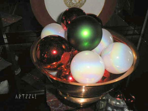
Simply put a few colorful ornaments in any container you have;

Christmas Fast Fix Decor

a basket, a bowl, any glass jar or vase available.

EZ PZ with things you already have.

Christmas Fast Fix Decor

Below, the ornaments are in a beautiful, giant copper leaf piece, a gift from one of my daughters. The little “Russian Doll” snowmen another daughter and I saw years ago while shopping at Sears. They were on the check-out counter and I said how cute they were. So the clerk said “Here, you can have these!” A memory moment for sure.

Christmas Fast Fix Decor

YES … you know it. Even my bathroom gets decorated.
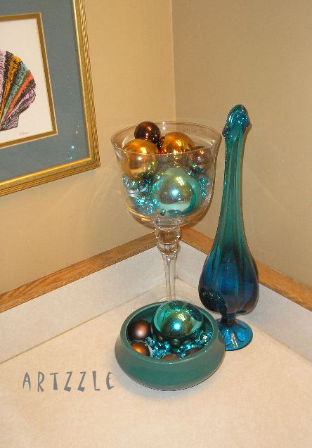
Christmas Fast Fix Decir

BLING belongs everywhere. . . you knew that, right!

Christmas Fast Fix Decor

2. PLANTS, PINES & BRANCHES

Pointsettias are everywhere. Buy one or two for important spots in your room. I’ve noticed great prices on these at Aldi’s and Wal-Mart this year.
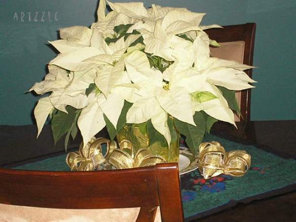
Christmas Fast Fix Decor

Pine branches are easy to come by and so are fake pine garlands.

Ease into Christmas "Feature"

A small grouping of pine, a faux flower and a Holiday item are an instant little vignette.

Christmas Fast Fix Decor

See, you don’t need a lot. Sometimes simplicity is elegant, effective … and FAST. And putting that blue plant container in a Christmas colored basket would be great too! The table runner is paper and ribbon. See below

3. BASKETS, BOXES and PAPER

Ease into Christmas "Feature"

Put one of your houseplants in a bright basket. Wrap some empty boxes in varied sizes and papers. Only takes a few minutes. OR you could wrap small items you’re giving as guest favors and throw them in a big basket. NO TREE . . . take a bamboo basket or tub, and put all your gift-wrapped presents in them. Lots of bang with what you have already.

4. RIBBON

This is one of the most easy and fun ideas. No pictures but just use your imagination. Make one big bow for a centerpiece. Make several small bows to scatter here, there and everywhere. Make a quick tree garland or wall banner with thick ribbon and a few unbreakable ornaments. Wrap jars with pretty ribbon and use as serving pieces … hold candy, silverware, extra napkins, etc. HAVE FUN.

5. CANDY

Christmas Fast Fix Decor

?? Candy ?? YES, that’s what it says. Hey talk about multiple duties: decor, gifts, food AND inexpensive. C’mon people, candy is perfect!

Stores have tons of beautiful foil wrapped chocolates and candies for the holidays. USE em! OR Candy canes are cheap, pretty and edible. Hang them on the tree, put em’ in a jar (with a ribbon tied round it).

The next shot includes Paper, Fabric, Pine Branches and Ornaments, used in pieces I already owned. AND this arrangement carried me during Fall through New Years that year!

Christmas Fast Fix Decor

TIPS: Re: After Christmas sales: 1. Look for designs that instantly catch your eye. For banners and many other projects, you’ll want variety so choose cards that have several designs in the box. These screamed my name right away. The design is big, colorful and generic themed AND the images are glittered = sparkle and interest. 2. Look for cards with COLORED ENVELOPES. That’s just more colored paper for any crafts!
3. Faux Flowers: Bushes of flowers rather than single stems, give you more bang for your buck. Just snip off individual blooms to scatter through the house.
4. Wrapping paper: I always buy the widest, longest rolls … not the short, skimpy ones. I look for paper in colors that can be used ALL YEAR ROUND not just seasonally. I buy as many coordinated patterns and colors as I can afford. Paper doesn’t spoil, right! 5. DON’T MISS your local thrift store sales, both before and after Christmas. TON’S of deals there and you’re supporting your community, too! 6. Always start with my golden rule . . . house shop first, use what you already have before buying more!

Christmas cards & colored envelopes Wrapping paper Fabric remnants Unbreakable Christmas Ornaments Houseplants Candy Christmas decor pieces (you already have) Already owned vases, jars, holders, etc.

FINALLY . . . here’s the EASIEST.

Christmas Fast Fix Decor

Take down some of your wall art pictures; wrap them with pretty paper and ribbon, then hang em’ back up. There you go … instant Christmas decor.

CLICK THIS TO FIND MORE EASY IDEAS.

Have fun with these. Hopefully you’ll be more enthused about the holidays now. I am 🙂 We’ll talk again soon.

I love getting comments and YOUR ideas too. Send em’ my way.

Later – Cheryl

It’s Gonna Be a BLUE Christmas

Hi . . . How are you?

I’m blue.

Well . . . at least my 2018 Christmas look is.

P1010022.jpg

Three factors determined our holiday decor this year.

  1. Low energy & ambition .
  2. Della
  3. Quick thrift trip

The last half of this year has been a circus of doctors, surgeons, hospitals and appointments, which has put energy levels, ambition and creativity on a constant roller coaster ride.  Things are much improved but still not up to par.

When Hubs began gathering the decoration bins, most sat unopened, as my mood quickly changed from excitement to exhaustion.  A peek at the ornament boxes revealed the blue, white and silver pieces on top, so that became our 2018 color scheme.

Holidays mean Hubs gladly allows me to do all of the decorating, especially the BIG tree.  Below is a look from past years.

The second obstacle this season is Della, our eight month puppy.

While still cute . . . not so small anymore.

She can only lay on top of that chair now.

So no big tree this time! Not yet grown out of her puppy personality (destructiveness).

The blues became official with a quick trip to a favorite thrift store, where ALL CHRISTMAS items happened to be 1/2 off.  Some great pieces, and so many in blue hues.

OLYMPUS DIGITAL CAMERA

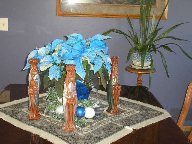
So at home, a blue Christmas it is, which works quite well with the new accent color we’re using in our open dining/kitchen area.

OLYMPUS DIGITAL CAMERA

A small tree instead of the tall.

OLYMPUS DIGITAL CAMERA

Little vignettes on the tables . . .

OLYMPUS DIGITAL CAMERA

. . . and the wall

OLYMPUS DIGITAL CAMERA

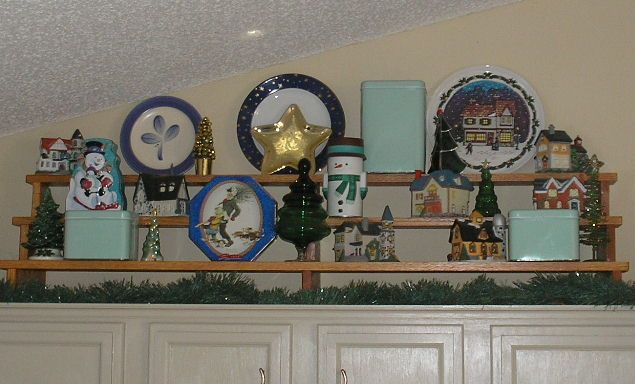
Cabinet tops join in, with glass, trees, plates and tins.

p1010002.jpg

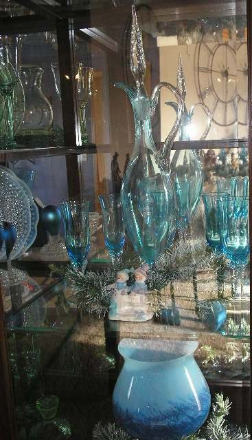
Our hutch is the place most fun.  Della can’t reach so it’s a safe one

Two nativity sets are always a go . . .

OLYMPUS DIGITAL CAMERA

. . .  it’s modern in the bedroom . . .

OLYMPUS DIGITAL CAMERA

and traditional on the piano.

With this Christmas of blue, my hopes are that you will enjoy this colorful season, too.  Have a wonderful holiday, stay safe and warm, and we’ll meet the new year together.

Merry Christmas from me and the Hubs 🙂

OLYMPUS DIGITAL CAMERA

Later – Cheryl

Purple . . . for Autumn??

Each week things improve and recently a bit of ambition struck.  I decided to paint my dining room area.  It’s an open space between the living and family rooms.  There are two smaller walls and one large, and so far the large, accent wall and one small area are done.

Hubs was a wonderful assistant and made things easier.  Odd as it may sound, the most difficult part of the project was deciding what color to choose.   In fourteen years, these walls have gone from the builder beige, to a deep taupe, a warm burgundy, a deep blue/green and most recent, a deep, warm brown, seen below.

OLYMPUS DIGITAL CAMERA

Lighting gives photos glare, but you can see the brown.  The print is something my husband and I picked out for that wall when we first moved in to this home.  He is very patient with all of my changing and rearranging, but the one and only time I moved the print to a different room . . . well let’s just say, he nicely requested made it clear he wanted it to stay where it had been.  And I’ve been fine with that.

Adjusting to all the recent changes in our lives, I just needed a new look, something brighter to get me through the coming winter.  New colors were narrowed down to a mustard gold, or a blue tone from the water at the right of the print.  I’m not much of a blue gal, but all the gold samples seemed too harsh and we jokingly referred to them as looking like baby poop 😀 .  And I DID want a big change.

We brought home several samples and are very pleased with the results of our choice.  I don’t think I could have gotten any closer to the purplish blue of the print’s water.  It also works very well with the lamps in the adjoining family room.  Bringing in blues, glass items and adding plants, it was easy to pull the two spaces together.

OLYMPUS DIGITAL CAMERA

And of course, when you change one thing, there are always others that pop up.  The table cover and the chair seat covers were very (normal) Fall colors, with oranges, beiges and deep burgandy.  At the moment, we’re using mismatched chairs and covers.

OLYMPUS DIGITAL CAMERA

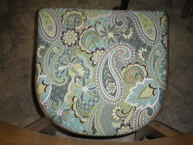
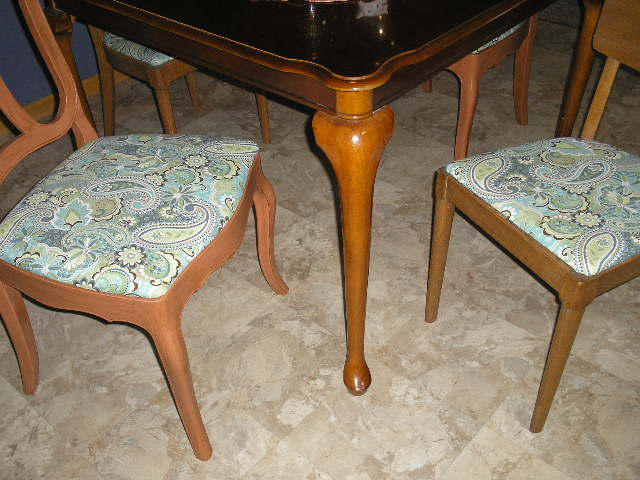
While healing, I’ve also been slowly chipping away at reorganizing my studio/office, and rounded up all my fabric samples.  While it isn’t perfect, I did have a large sample of a modern paisley print in many shades of blues, a light off-white and a touch of two shades of green.  It looks bright and fresh, so I covered my chair seats.

OLYMPUS DIGITAL CAMERA

Oh, nice.  I just noticed a touch of dark brown here and there, so that helps unite the woods in the furniture and the print frame.  This time I used the same fabric on both styles of chairs.

OLYMPUS DIGITAL CAMERA

To finish things, there is just enough fabric left to make a table runner.  Until I get to that, I’m using a square scarf that plays well with everything.

OLYMPUS DIGITAL CAMERA

Regarding the work in the office, well it’s at the “it has to get worse before it gets better” stage!  I DO have all the shelves and cabinets in the closet done.  Now it’s a matter of seeing what I can donate, sell or throw.

I had one wall in the office repainted, before I went into hospital.  There’s one big and one small wall left to fill, sand and paint.  I’m REALLY trying to cut back on furniture pieces and all my craft stuff in there.

Luckily for me, I have two neighbors who are 3rd grade teachers and I think they may like quite a few of my supplies.

A quick health update.  I have two more surgeries coming up, and hopefully both can be done by end of year.  I want to think of it as 2018 – the year of the knife, but hoping that 2019 is the year of a new life!

Finally, before closing, I am noticing that several people are sharing my posts on facebook, 22 the last post.  That is all fine AS LONG AS YOU ARE CREDITING ME FOR MY POSTS AND PHOTOS.  I ask that you please leave a comment on my posts that you share.  That will mention your site as well, and give us BOTH exposure, and me, the credit due me.  Thank you for your understanding.

As I’ve noticeably skipped Halloween topics this year. just go to the search window and put in Halloween, Fall, Autumn and like terms to see my many previous posts.

Thanks for stopping by.  I hope to post again before Thanksgiving, but if not, enjoy your holidays.  Stay safe and stay positive.

– Cheryl _


March Means Greens

     If you don’t already know  . . .  I’ll tell you now, March is my least favorite month.            I’d prefer to skip it entirely and go straight to . . .  April.

This year, I’m trying to kick myself in the rear, and steer clear of the doom & gloom.  March is associated with many things green, so let’s put some of them in a room.

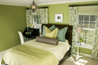
People associate greens with landscapes, and that may be why they feel comfortable using those colors in their home.

A light wallpaper and darker accents are fun here.

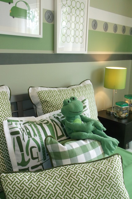
A larger concentration is used below.  Notice they’ve chosen a monochromatic scheme.   This is where varied tints and shades of one color are used.  This can be done gradually for the hesitant decorator.  Choose one color you enjoy, and work it throughout your space, using light to medium tones, then darker as you become more confident.

The idea of any saturated decor colors is frightening for many of us, though.  Greens are not the first choice on my walls either.

Our home has a very open floor plan.  Entering the front door, you are immediately in the living room, from which you can also see through the dining room, into the family room, and down a hallway to the private areas.  This room (below) and down the hallway, are done in a light, neutral; a custom color I have used for years in other homes as well.

Neutrals’ accomplishments are many.  Here, it provides a clean look, a feeling of spaciousness and light, and is a wonderful backdrop for large art pieces.  Finally, it visually leads your eye down the hallway, and out to the adjoining rooms.  Your rooms should “play nice with each” 😀 , and continuing colors helps unite them, giving your spaces a comfortable flow.

Longtime readers and followers know that I’m NOT afraid of bolder colors and deep tones, but I have a definite plan with all colors as they play throughout my home.

If you are a neutral person, or just not ready for prime time, take baby steps and do a little experimenting, using accessories for your color and interests.

Greens are such fun to work with, and as noted, are the colors of nature which often puts people at ease.  The easiest green in decor is PLANTS.  Easy as 1-2-3 … colorful, affordable and moveable.  (And easy to replace if you have a brown thumb 😦  ).

Set a plant most anywhere and add a few favorite pieces with it.  Here, we’re using the MAGIC #3 Rule of Display; 3 different objects, 3 different textures, 3 different weights and heights.  Three items are always a great way to start any display, then it’s easy to go from there!

The above plant (variegated hoya) provides it’s own three, with light and dark, and white sprinkled leaves.  This plant can also produce cream colored leaves.

USE WHAT YOU HAVE.  I’ve had this versatile baker’s rack in three homes.  Here it helps me group big plants in one space, for light and easy watering.  But small plants work too.

These two are African Violets.  They need light but not bright sun.  More importantly, they need to be kept damp … NOT dripping but, damp.

And below is a simple (but super) philodendron.  It takes quite a bit of abuse.  Throw a little water on it, once or twice a week, give it a little light and room to grow.  Mine is supported with a little metal stand (thrift store find), but a simple wood stake or branch will work too.


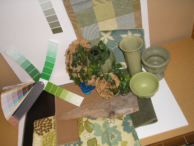
Nature items i.e. wood pieces, stones and collected items, work especially well with greens – but just about any other color too.  Pick up several color cards at your favorite paint supply store.  Then shop your home for decor items, fabrics (even scarves from your closet).  Put all together and just live with them for awhile.  It’s a great way to start and then take it from there . . . when you’re ready.


I owed you all a long post, as it’s been quite a while since we connected.  I always enjoy your thoughts, questions and comments . . . BUT BE SURE to mark the box below the post, to receive follow-up comments.

Later – Cheryl

A January Jumpstart

The house looked a little empty today,
with the Christmas color packed away.
Even though the day was sunny and bright,
I’m too tired and lazy, to set things right.
From my favorite chair, I took to the net,
to see what inspiration I could get.
Color and clean lines are two boosters for me,
add some great displays to make it three.

Enjoy the pics and explore the source links. They’re sure to jump start your January!


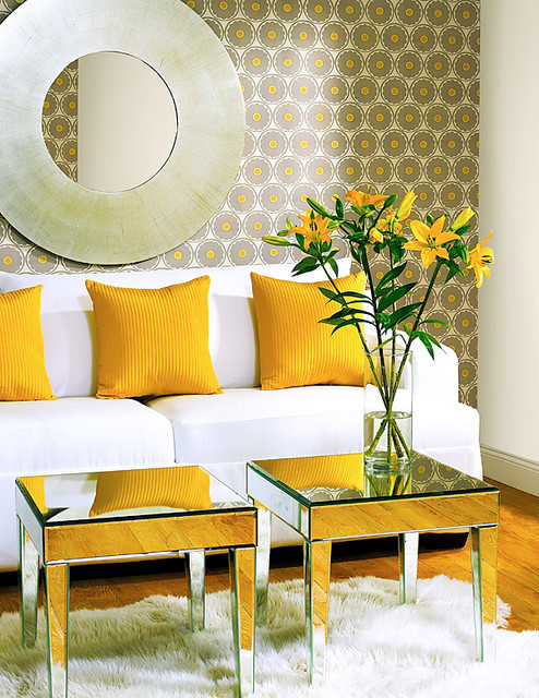
Upon discovering this photo quite some time ago, I literally gasped and knew it had to be saved for a future post. A wonderful example of how display can be so very simple but achieve such breathtaking reactions.

This is from one of my HOUZZ Ideabooks “Color”. It’s really In Your Face but in a nice way.

Ah, can I ever stress “Simple” enough? Substitute “easy” if that’s the word you prefer. Either way, this look could be done by anyone, It just made me smile.

Speaking of smiling.

Simple, simple, simple but so effective! Okay, you get the idea.

Everything just fantastic here and it all works together perfectly. Wonderful display with my three “C’s” Clean, Comfortable, Colorful. Wow.

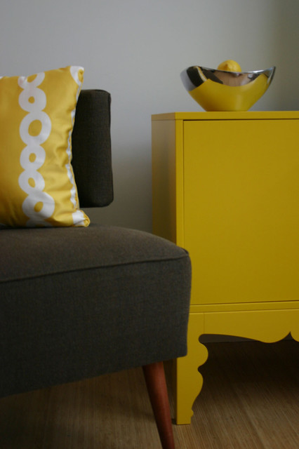
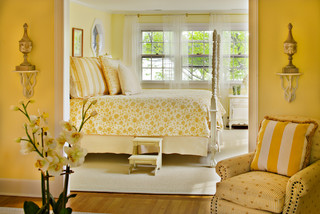
I’m not even much of a “yellows” gal but how could anyone not enjoy this (at least just to look at)!


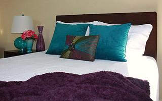
And MORE color here! Ahh. And once again, simple. Start with a neutral wall color (will work with lots of themes), choose an inspiration piece (the beautiful toss pillow), bring in colors from that item and finally add an accent color for some extra pizzazz. Here it’s the coral flowers on the nightstand. This is also a great example of some of the “rules” I use. The nightstand has 3 simple items at 3 different heights. There are 3 smaller toss pillows and yes, only two bigger pillows BUT together, you’re still working with an odd number in your display. Unlike what we’ve always been told, ODD is good, DIFFERENT is delightful.

Remember decorating is personal so make it “YOU”. And don’t forget that decor rules are the stairway to your design, but it’s OK to skip a few steps. My Magic #3 is a suggested place to start, but once you get your motor revved up, take off down your own road.

Think my guests would appreciate this guest room. I sure would.

And finally, sometimes we just need things to be black and white.

This is such fun, I could go on forever, but have to get going on my house. Well, I’m cheered and this has kicked me into, if not HIGH Gear, at least to a bit more driven speed. So I best get goin’ while the gettin’s good!

January can sometimes be gloomy, but find ways to stay positive and you’ll stay productive too!  We’ll talk again soon.  Leave a comment and it’ll be even sooner 😀

Have a most Happy New Year.

Later – Cheryl

You’ve just read “A January Jumpstart” featured first on Artzzle.com. You’re invited to ask a question or leave a comment. I look forward to your input.


Still Hangin’ Around

Promptly on January 1st, the decor changes in our house.  Ornaments are carefully removed, wrapped and safely stored away.  The Christmas tree is dismantled and enters it’s box for another year of hibernation.  All on New Year’s Day . . . but not this year.

We’ve kept the holiday hanging on a while longer this time.  More family coming on Saturday, so I just couldn’t change things out yet.

Red and gold are primaries on the tree and . . .

OLYMPUS DIGITAL CAMERA

a lot of red and white pop up too . . .

OLYMPUS DIGITAL CAMERA

all over the house.

OLYMPUS DIGITAL CAMERA

Our kitchen cabinet tops are one of my favorite decorating spots.

OLYMPUS DIGITAL CAMERA

This season was no different, including the stacked shelves,

and a few side arrangements.

This creche of cute characters was a new addition this year, and these other funny little pieces too.


Well, with only two more days to get ready for my company, I had better sign off.

Before leaving, I want to share the beautiful gift I received from a special friend.  Thanks Nadean, it’s perfect and I absolutely LOVE them.

OLYMPUS DIGITAL CAMERA

Just want you to know that Artzzle is “Still Hangin’ Around” too, and I hope to connect with you more often this year.

Here’s wishing all of us a Wonderful New Year.

Later – Cheryl


ORANGE . . . one of my Favorite Colors

Combine it with clean lines, lots of light and plenty of white, and see how orange breathes new life into this neglected mid-century home featured over at HOUZZ.


Hope everyone is having a safe and fun 4th of July.

Later – Cheryl


Loving This Look

Our winter has been a light one, meaning little snow.  In Minnesota, it’s what is sometimes called a “brown winter”.  It does look a bit more friendly, but temperatures still restrict you to inside projects.

This is the exact time of year that we get antsy to do something.  The cleaning and purging could use a little more work, but at this point … boring.  Coming up with a project or two is easy enough.  The problem, as usual, is limited funds.

Long-time followers will remember nearly 4 years ago, we restyled and refinished  the cabinetry in our bathroom.  It has been  is holding up quite well and we still enjoy the look.

Bathroom cabinet redo with Rustoleum Kit

The bath color is a muted, dusty gold, although this picture doesn’t capture it well.  Most of the other tones in our open living areas are similar and neutral, and I do want to stay with those.  But we’ve been wanting a bit more color and the bathroom walls seemed a good place to add some.  This means paint of course.  In this case, the colors in my stash weren’t what I had in mind.  There was a good paint sale in the area, but it was still above what we could spend.  And then …

At Wal-Mart, on a sale table, I discovered a gallon of their “grab n’ go” paint in the aqua color.  At $11.00, it was a good price, but I had big reservations.  It was a semi-gloss finish which I felt might be too shiny.

I was considering a turquoise color that would match the current accents in the room.


This color seemed too bright, so I decided against but I kept thinking about it all week.  The next trip in, it still sat on the sale table … but now it was at $5.00 on markdown.

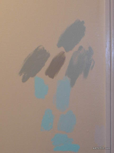
Now, most of you know I am a big proponent of mixing my own paint colors.  I bought the aqua gallon, and a quart of light gray in the same brand and finish.  At home I removed approximately 1/3 of the aqua (saving it, of course), and added most of the gray.  The result was much tamer so I did a sample wall.

Bathroom Wall

Still much too bright for us.  I wanted a much “dustier” shade, and so did a bit more experimenting.  For my darkening color I used a warm, deep cinnamon brown in a finish just one step below semi-gloss.  Each test got a wall splotch, until I hit on what I was going for.  I settled for the very top color in the picture below.

OLYMPUS DIGITAL CAMERA

We’re very pleased with our results

Aqua Bathroom

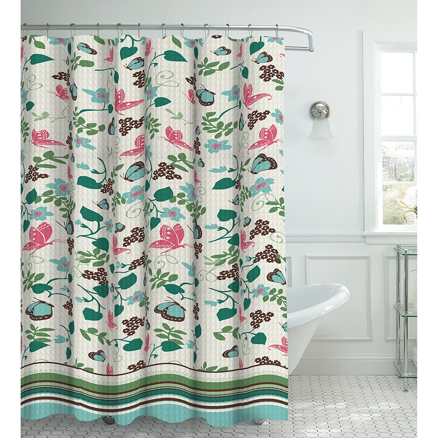
We have a few more small projects for this room.  We plan to frame the mirror, and replace the wooden backsplash with glass tile.  AND … I’m changing up some of the accessories, starting with this gorgeous shower curtain that is an early Mother’s Day present from my daughter (thanks, Breezer)!

91FLpewC-6L._SL1500_

I’m lovin’ the coral, purple and all the aqua and greens in this.  Can’t wait to buy towels LOL.

I’ll keep you posted.

Meantime, I would LOVE to hear what you think about our latest project.  Remember, when you leave a comment for me, check the box to receive answer comments.  My site systems don’t allow an automatic answer sent back to you.

Thanks for stopping over.

Later – Cheryl
 

DINING ROOMS In Tight Spaces

night-23

Source: DINING ROOMS In Tight Spaces

We all have to eat . . . and maybe we can all have a dining room too.  Check out this fun article from Rowe Spurling Paint.  Love their site.

Have a great weekend, and remember . . . staying positive helps you stay productive too!

Later -Cheryl @ Artzzle
Following Trends … or NOT

Long time readers know that in the past two years, Hubs and I have been redoing the cabinetry in our little house.

The one and only bathroom was attacked first,  with B4’s featured here and resulting AFTER’s here.

It was not too difficult, but very time consuming.  When finished, we decided to live with it for a bit, wanting to evaluate the products chosen, to see how they held up under wear and tear.  And then too, we were just pooped and needed a break.

The kitchen project ahead, took more consideration.  Go with all one color on those cabinets, or the two-color combination, then a big TREND.
And if two colors were used, would uppers be one, and lowers another?  Would everything on the walls be the same and only the island different?  While on break, a color strip from our local True Value store was agreed upon, and a dark tone from that was used for a quick redo on our island.

Newly Redone Kitchen Island

Through the next year, we painted all upper cabinets in a lighter tone (from that strip), and the remaining lowers were done to match the island.  Will the two-color look go out of style?  Honestly, we don’t care.  Our decisions were based strictly on what we liked and thought we’d enjoy for a long time to come.

Artzzle KITCHENS, COUSINS and CABINETS feature

AND, it’ll be just fine, because . . . we’re not going through all that again … at least not for a very.long.time!

There needn’t have been any worries about styles, then or now.  Trends in kitchens continue to be varied in styles and materials, as well as colors.

The HGTV newsletter recently featured this great collection of kitchens.  Every color – or combination of, along with woods, steel, glass, copper.  And cabinets – modern, closed, glass doors and/or open shelving.

HKITC108_After-Full-Kitchen-Orange-Cabinets_4x3.jpg.rend.hgtvcom.966.725

Above is one of my favorites from the article.  Ya all know I love cozy spaces, AND the color orange, of course.

GH2012_Kitchen-01-4-Hero_s4x3.jpg.rend.hgtvcom.966.725

↑↑  Here’s a definitely different look . . . and unique combination of materials.

DP_Renewal-Design-Build-White-Kitchen_s3x4.jpg.rend.hgtvcom.966.1288

↑↑   This could be considered a combination of old and new looks, with the glass doors and open shelving.  Nice use of small spaces.

H2DSW206_Blue-Kitchen-2_s4x3.jpg.rend.hgtvcom.966.725

↑↑ Talk about color.

Be sure to check it out.  The article has 100 different lovelies to look at.

TIP:  Treat Trends as Treacherous Territory
TREND is one of the words to be used very selectively in decorating. There are always certain looks, colors, objects and so on, that are popular at any given moment. That’s fine and can be fun when with small items or a can of paint; things that can be easily and cost effectively changed out.

TIP:  Take time with MAJOR decisions, changes & purchases
Make sure you go with something you like, enjoy and will be comfortable with for an extended time.  Don’t do something big, just because someone says it’s the trend.

When in doubt, it usually works out to go a bit more neutral in expensive areas, and dress them up with smaller items as “trends” change.

I’ve never really cared to fit myself into y specific “Style”.  I approach decor and design differently, especially when working with others, and that “what style am I” question comes up.  For me, it’s important to stress that they explore and not to trap themselves into one concentrated look.

We’ll talk again soon.  Meanwhile, do a little decorating to chase away those January gray days.

Later – Cheryl