This was one of MY favorite posts from 2018, so am showing it off again 😀
When I pull out a flip chart of paint cards, sometimes the reactions are alarming. So many people are intimidated … literally afraid of using color, and to them, thinking about all those choices is frightening.
Going to completely the opposite direction, let’s consider WHITE. Take a look at this little post from Daily Dream Decor that I found over on Bloglovin.

There are some great ideas here, but if that were the whole house, someone would have to lock me away in a private little white room! 😀
Rental apartments are notoriously painted in white or very light neutral colors. That’s an easy way to ease into color. The way to do that is with accessories. Below, they’ve used naturals (dark wood & plants) and a trio of golds, oranges, browns and greens in the accessories. So the “all white” room looks wonderful, not boring.

Decor gets braver in the living room below, where they’ve used color on the permanent pieces, i.e. couch and chair. White remains predominant on the walls & ceilings, the rug, lampshades and even the plant and framed art. But NOTE the window sheers are coupled with a slightly deeper neutral, a beige that works into the orange toss pillows. Finishing touch is the deeper tones of the vase and flowers. Everything inside also tends to play nicely with the outdoor view.

Dark floors give light neutrals life and ground the room. Here other accessories in similar shades as the floor, help pull your eyes through the room. Here again, a fun large plant adds additional color to the room, as well as texture and interest.

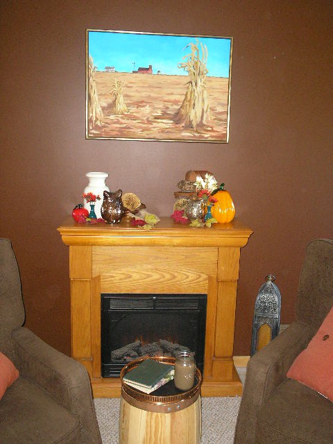
The living room below is much braver. The dark floor color continues up the wall in the fireplace surround. The gorgeous green really livens up the room and is repeated in the area rug. The third color orange is a great accent to all. NOTE how wonderfully the art work and metals unite it all to produce a great look.

A totally different affect is seen in this final shot. The ceiling has been painted in a dark color, and the majority of the floor is light, covered partially with the geometric rug. Lively colors and textures add interest throughout, with the art, lamp and coffee table tones. NOTE how the dark plant and white vase take your eye down to the black & white rug, which of course reminds you of that ceiling. The green pieces add fun, with the turquoise and green glass the wow factor.

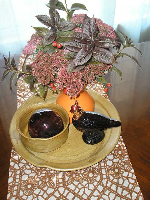
Black and white sprinkled through a room help give the eye a break, a resting spot. This tip works in display too.

Whether you’re a “white wall” person or someone beginning to experiment with color, I hope you’ve enjoyed my post. I love comments, so let me know what you think.
Until next time.
Cheryl