Easy Color Schemes … for anyone to use

Choosing colors to use in your home? Does the very thought of it put worry wrinkles on your brow or get your stomach growling? Would it be easier if you only had to pick one color … just one?

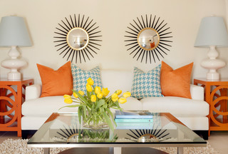
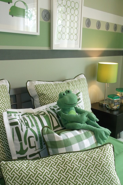
For those who worry and fret over paint color decisions, a monochromatic color scheme is an easy and safe design approach. This simply means choosing ONE COLOR, but then working with several tints and shades of it, to provide your differences and interest. Below is a wonderful example.

Beautiful design here. Notice how interest is brought in with varied patterns and textures, which is another way to enliven any room, but especially with monochromatic schemes.

It’s almost that easy … but not quite. You need to be aware of two factors for any color schemes, but especially with monochromatic. Be conscious of and able to recognize that every color has a warm and a cold version, and for the most part, colors from one don’t work well with those in the other category. Coincidentally, individuals tend to prefer either one or the other.

And wherever you are painting, first make note of the lighting options in all of your areas. Windows come to mind immediately, but also notice which directions the window’s light comes from, and at what time of day it is most effective. Also remember your mechanical options; overhead and cans, lamps and task lighting.

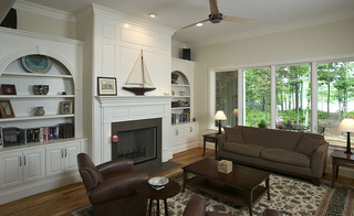
Above they’ve chosen to use the same color on every wall area, and bring in the lighter and darker tones with accessories. A beautiful look, but the room would also be a perfect candidate for a more developed monochromatic scheme. The recessed alcove and it’s interesting layered opening are perfect opportunites for varied tints and shades of the main paint color.

A MCS works in rooms of any function and size.

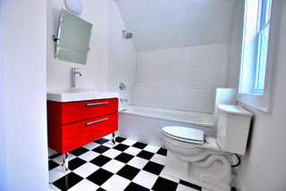
This bathroom is a great example of how to utilize a monochromatic scheme. Here literally everything is rectangular, the shape of the room itself and all in it. This could be boring and bland, or overdone with too many colors. But by distributing tints and shades of gray, each area has it’s own identity yet nicely cohabits with its’ companions. Don’t miss the textures featured here. The very subtle color variances in the larger shower surround tiles. The shiny glass, smaller subway tile of the backsplash. The walls in different tones, and the dark wood vanity that grounds the room. Look closely and you’ll see a very small design in the flooring. A great way to accent everything AND unite the room, is their use of the strips and borders of smaller, dark gray tiles. Very nice.

How about a different color. Granted, purple isn’t for everyone, but below shows a good way to place your tints and shades; darker colors in brighter lighted areas and vice versa.

Note here that in the brightest corners by big windows, they’ve used the darkest shade of their color. The mid tone is mid-room and the lightest is in the bed alcove and on the ceiling. Very dramatic use of purple here. I applaud their bravado.

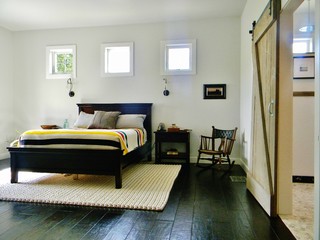
Below is a dramatic corner in a monochromatic room.

This isn’t my preferred look or style, but it is a nice area, and great use of a MCS. I especially like the ceiling treatment, with different colors on molding and walls. Details: note the interesting level at which the draperies are hung; the fun textures in the rug and pillow. And the varied patterns and piping of the chair. Even the decorative accessories on the side table coincide with the scheme, in textures and colors.

How about a few living rooms?

Very nice.

Yes, above is a gorgeous MCS, exquisitely designed. But wouldn’t you just love to plop a big, bright colored something on that table at the far window, if only just for shock value? (Am I bad?)
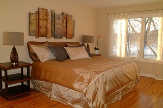
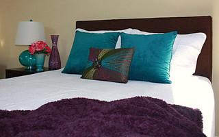
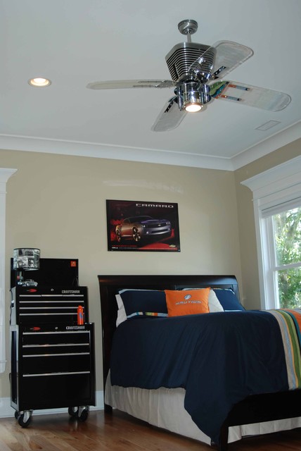
One more bedroom.

I have this room in more than one of my HOUZZ ideabooks. I just feel good instantly, every time I find it. But it is also a great example of a MCS. It’s lovely and looks so comfortable. Just what a bedroom needs.

Open floor plans are in so many homes today, either by new design or through remodel. The concept is very popular, and a huge selling factor. There are several reasons why I recommend using monochromatic schemes in these spaces. For builders, MCS can be both neutral enough to not be offensive to clients, but still interesting enough to be eye-catching, worth remembering. Any home for sale, whether new or existing, has to give the prospective buyers something great to remember when viewing so many properties.

A monochromatic scheme is also much easier to work with, for first time, or inexperienced home owners. Tackling large spaces such as those above, can be worrisome for anyone, even decorators. This area has so many wonderful details in its’ design, that paragraph upon paragraph could be written.

Instead, have some interactive fun. You tell me. How does this demonstrates a monochromatic color scheme? What details, textures and colors do you see here that work so well? Or perhaps you don’t feel this IS a workable space for you. If so, why not? Comment below and lets get a discussion going!

Meanwhile, don’t stress too much about any project, just start and things will evolve.

Later – Cheryl

Thanks for visiting. You’ve just read “Easy Color Schemes” my original article, first seen on Artzzle.com. I love comments and questions so send “em” my way. And be sure to spread the word about Artzzle to your friends. The more the merrier!

Copyright © 2013 Artzzle All Rights Reserved

Remember, all content on Artzzle, text and photography, is copyrighted and cannot be used in any form, without my expressed permission, or approval from material’s originator(s). You can leave a comment below with any questions on this.

What’s the Difference … Staging vs. Decorating

Hi there. I’m back to an earlier posting schedule, hoping to get at least two notes out to you this week. Last time we spoke of staging vs. decorating, and I wanted to touch on some of the differences today. Yes, there is a difference … a major one! But it’s not complicated. I like to keep things simple, and tell people to just think of staging vs. decorating as public vs. private, or leaving vs. living.

In staging, you’re leaving the home, you are appealing to the public so you want others to be able to picture themselves there. When decorating, you are telling your private story, sharing your many treasures to show how you live there. As sellers, remember that you are leaving now, so pack up all the personal stuff.

For a good example, I compare home staging to theater staging. In school and community theater, I’ve often helped build and prop sets for plays. On stage, limited spaces must represent several places. You have to define a room but leave it open to viewer interpretation. You also have to limit your props to allow actors to move about freely. In effect, you’re presenting an illusion, giving people a sense of something, which then allows them to imagine further.


This room is wonderfully staged. Colors are VERY neutral and decorative props are basic. Bare windows and good arrangement instantly show off the $$ lakefront location and invite the viewer through the room take a closer look at the water. If decorated, walls could be more colorful, and windows would be draped. Table tops and couch would not be bare, and the mantle could display a favored art piece and more personal treasures, rather than the generic pieces featured..

In staging your home, the goal should be similar to the theater set. Give buyers the illusion of what a wonderful house it could be for them. You want your prospect to get an immediate sense of the room, but keep it basic to allow them to imagine what it could be if it were theirs. You’re leaving and you want them to come live there.

All white vs. color is sometimes a debate when staging. The idea that everything should be painted white when staging, is a bygone premise these days. As a long time realtor turned stager, I’ve realized that all white is a negative more often than a positive selling feature. It presents coldly, often stripping a room of warmth and character possibilities. Those fearful of too much color are just as hesitant with none at all. A soft, neutral hue is comfortable but not frightening to most everyone. To stage this room, I would paint a very light, warm beige (taking colors from the tile in the adjoining room). This would compliment the warm, mixed wood tones and also accent the next room, creating great flow.

For every statement or suggestion in decor, an opposite or contradicting view can be presented. While white walls can be cold, this room is certainly not chilling. Here the walls are accompanied by warm toned accessories, lots of marvelous textures and basic but BIG decor pieces, which stage this space beautifully. Again, in decorating there would be a bit more accessories on the bed tables, and perhaps a bench with area rug at the end of the bed.

I feel this would definitely be a staged room. Light, bright but not ALL white. A little tricycle prop in the adjoining room. Nice, but if there are little tykes to go along with the trike, it’s doubtful you would have white cloth dining chairs and crystal vases on the table for everyday living. And speaking of walls, that paint had better be highly scrubbable in such a light color.

I’m torn with this shot determining staged vs. decorated. This is just a gorgeous space how ever you look at it. It is definitely nicely decorated (love it) but I think you would get plenty of “ooh ahhs” from prospective buyers as well. And when selling, you have to also give people something GOOD to remember you by … so they’ll buy!

This is a wonderul example of what just a touch of wall color can do. Picture these rooms WITHOUT the gray upper walls. Even with the dark counter and floors, it would just be bland. The gray zips it up and adds a certain something … warmth … elegance. (I dislike the word “pop” in decor).

Wow. This is a decorated vs. staged for me. The distinctive blues used are very personal color choices, not favorable to everyone. And I enjoy all the personal pieces on the shelves. Mine would certainly be filled this way to live, but perhaps not to sell.

While many believe that dark colors should never be used in small rooms, I feel they can be very effective, and shouldn’t be dismissed when decorating. I applaud the bravado of color choices in this as a personal space, but for staging … not so much. Great living room though, but I like LOTS of color. Your buyers may not.

Whether you’re selling or staying in your home, it’s good to clean out the clutter and less stuff is usually better than more. In staging “pieces” should be effective while kept to a minimum. But likewise in your personal decorating, don’t display every single thing you own all at once. By changing out items and displays, you give yourself several new looks over time without being over board at any time.

Above all, have fun and … don’t stress, just start.

Cheryl

Thanks for stopping by. You’ve just read “What’s the Difference …Staging vs. Decorating” featured on Artzzle.com. You’re invited to ask a question or leave a comment. I look forward to your input.

Copyright © 2013 Artzzle All Rights Reserved

A few “Ohh’s and Ah’s”

Not very driven with ambition today, but I need to accelerate it and get the house ready for weekend guests arriving on Thursday evening. So after the usual morning computer check, a little (LOT) instant inspiration was required. I’m sharing some findings that boosted my spirits, some uplifting “Ooh Ahs” for inspiration. Hope they work for you too!

As usual, click on the pics to enlarge them and explore the links for their sources. Enjoy.

Upon discovering this photo quite some time ago, I literally gasped and knew it had to be saved for a future post. A wonderful example of how display can be so very simple but achieve such breathtaking reactions.

This is from one of my HOUZZ Ideabooks “Color”. It’s really In Your Face but in a nice way.

Ah, can I ever stress “Simple” enough? Substitute “easy” if that’s the word you prefer. Either way, this look could be done by anyone, It just made me smile.

Speaking of smiling.

Simple, simple, simple but so effective! Okay, you get the idea.

Everything just fantastic here and it all works together perfectly. Wonderful display with my three “C’s” Clean, Comfortable, Colorful. Wow.

I’m not even much of a “yellows” gal but how could anyone not enjoy this (at least just to look at)!


And MORE color here! Ahh. And once again, simple. Start with a neutral wall color (will work with lots of themes), choose an inspiration piece (the beautiful toss pillow), bring in colors from that item and finally add an accent color for some extra pizzazz. Here it’s the coral flowers on the nightstand. This is also a great example of some of the “rules” I use. The nightstand has 3 simple items at 3 different heights. There are 3 smaller toss pillows and yes, only two bigger pillows BUT together, you’re still working with an odd number in your display. Unlike what we’ve always been told, ODD is good, DIFFERENT is delightful.

Remember decorating is personal so make it “YOU”. And don’t forget that decor rules are the stairway to your design, but it’s OK to skip a few steps. My 3 Rule is a suggested place to start, but once you get your motor revved up, take off down your own road.

Think my guests would appreciate this guest room. I sure would.

And finally, sometimes we just need things to be black and white.

This is such fun, I could go on forever, but have to get going on my house. Well, I’m cheered and this has kicked me into, if not HIGH Gear, at least to a bit more driven speed. So I best get goin’ while the gettin’s good!

Before closing, I want to thank everyone for your condolence emails, at the passing of our beloved pet Freddy. In decor I always say “don’t stress, just start”. As everyone knows, life isn’t ever that easy. But kind words and a smile certainly help us all along the way, so thank you all.

– Cheryl

You’ve just read “A Few “Oohs and Ahs” featured on Artzzle.com. You’re invited to ask a question or leave a comment. I look forward to your input.

Copyright © 2013 Artzzle All Rights Reserved

Industrial Look

Just a quick note today. After my “industrial” boys room ideas, I wanted to give you a visual of how you could use the pieces I mentioned in that article. I went on HOUZZ and searched for tool box ideas and tool box furniture and these are a few I found.

Really not much to say. This is just a great way to use industrial items as normal furniture.

This shot uses a complete set of tool boxes as a dresser/nightstand.

Although not my style, this is another good example of a varied use.

Here is another room where industrial items were utilized.

Finally this unique bathroom vanity via tool box.

Though not finished as yet, an inspiration page is in progress, that will share many online sites I love. Houzz is at the top of the list.
houzz_logo
www.Houzz.com

A devoted Houzz follower for quite some time now, they’re #1 for me and I’m on their list to receive regular updates. WARNING! If you love your home, this site can be highly addictive.

Not sure when you’ll see the next post. Hubs is off all week next week, over the holiday.

I hope you all have a safe, fun 4th of July, and as always, don’t stress, just start.

Later – Cheryl

“Tool Time” Bargain Boy’s Room

When my son and daughter were young, I found decorating his room wasn’t always as easy as her space. With furniture I like pieces that can move with them as they go out on their own. In this week’s Menard’s Sale Bill, my imagination went wild on ideas for a cool boy’s room, and everything would be appropriate for any age (once out of the nursery/toddler phase). All you need is a bed and some paint and you’re set to go. Take a look.

Most boys idolize dad and want to be just like him. What better theme for their room than “Tools”. All of these items are sturdy, durable pieces that can go from bedroom to apartment to home/garage as the years go by.

This is actually two separate pieces; the smaller chest could be used as a night stand and the larger chest for dresser.

This is actually two separate pieces; the smaller chest could be used as a night stand and the larger chest for dresser.


At a sale price of $69.00, that’s a bargain, and much more durable than new dressers in that price range … you might even be able to get two. You would have two nightstands, and two bureaus. Or put a topper across the two larger pieces to make a desk or work space. All kinds of possibilities here.

A melamine panel would work for your desk topper. These were $22.99 after a $3 rebate. Take your measurements and ask if the lumber department will cut the larger piece to desired size.
Boy's Room

If you want a separate table/desk surface, consider two of these sawhorses as legs for your topper. $8.99 each, and supports up to 2,000 lbs (YES thousand) per pair. Again, you could utilize the metal industrial feel or paint in a color.

Boy's Rm saw horses

If you just want a table period, no work involved, this 4′ one works well. I know it’s sturdy because I have one. At $19.99 it’s a versatile piece that can easily be stored away or moved to a different room for any use.

Boys rm table

These metal shelves are solid, but could always be screwed to the wall for safety concerns. A price of $49.99 will give a lifetime of use, literally. The metal can easily be spray painted to brighten it up a bit – or not for the industrial vibe. Like wise the shelves can be painted or covered to tie in to the decor scheme. This could hold a lot of colorful bins, boxes and toys.
Boy's Rm shelves

This 5′ x 7′ rug is another double-duty item. Use it as carpet on a hard floor, or over good carpeting that you want to protect. Can be easily rolled up and stored away if neccessary. Brings in quick color.
Boy's Room Rug

Bedrooms always need storage, and especially kid’s rooms which often tend to be on the small side anyway. Here are two double-duty pieces. The hanging piece could hold anything from jackets to jump ropes to who knows what. How masculine is that!? It is $14.99 with the $10 mail-in rebate.
Boy's Rm accessories 3
And why couldn’t this garden cart store toys or all that “boy stuff”? It’s $14.99 with a lid as a work surface and wheels so it can move anywhere you want. Roll it easily to any room to play and back into the bedroom when guests show up!
Boy's room toy chest

Don’t forget, every room needs accessories, right? How about some of these?
BOGO deal here, with this storage organizer. You get not one but two for $4.99.
Boys Rm Accessories

This steel tape measure will always be useful, but probably should be for a bit older boy. Great to help dad with his building projects. It’s $1.99 after the $2 rebate.
Boy's Rm Accessories 2

Okay, next you’ll be saying …What?? … a solar light, really but use your imagination here. It’s red-whits-blue and matches the tool chest and the chair. Remove it from the stake and in a sunny room, it would charge enough to be a great nightlight. There are even color changing LEDs. It’s only $4.99 and if you don’t like it inside, stick it in the garden. 🙂
Boy's Rm star light

Every bedroom needs a chair. Here you go. This fits in with everything else and hits the mark for a boy. Take it anywhere or leave it in the room. Hey at $7.87 get an extra one for guests.
Boy's rm chair

You may think I’ve really flipped my lid with the last two, but again, get funky here. What could you come up with for the foam noodles? Could they be slit and used to cover table legs? Or hey, just a fun toy.
Boy's room accessories 4

The flag would be a great wall hanging or if it is cloth not plastic, it would make a great pillow cover.
Boy's Room Flag

There you have it, a nice list of unique possibilities; affordable, durable pieces, most of which are useful lifelong. You may not be doing an entire room all at once, but at these prices, perhaps one or two of the large items could be your beginning point. Or, if you have shelves and a dresser, just have fun with the accessories as useable decor items.

COLORS: I prefer to stay away from the cutesy boy/girl colors. A neutral room will weather more years and doesn’t have to be boring. For blue tones, take a look at these BEHR colors: Rainy Sidewalk HDC-CT 24 or Soft Denim ICC-46. I also suggest Gallery Taupe ICC-89 or Cotton Grey HDC-NT 20 for workable colors. Any of these will rework into other accessory color schemes too, as your fella grows up.

Today’s helpful links can be found here.

MENARDS

BEHR

HOME DEPOT

Leave a comment with your ideas for a “Tool Time” boy’s room. And by all means, let me know the lowdown if you do this in your guy’s room; especially pictures. I LOVE pictures.

As always, just suggestions so don’t stress, just start.

Later -Cheryl

Copyright © 2013 Artzzle All Rights Reserved

May Day Flowers

Yesterday was the first of May, but this year’s weather has kept most spring blooms away. Growing up, we kids would make all kinds of paper flowers to decorate little May baskets for our friends. After school on May Day, we’d deliver them to the recipient’s front door, ring the bell then run and hide to watch them find the surprise. That was one of my daydream memories as I tried to ward off the depressing reports of more snow to come!

The beauty of flowers is cheering anytime of year. Who doesn’t like to stroll through a gorgeous garden, give or receive a bright bouquet on a dreary winter day. Working as a florist was most enjoyable and gratifying for me. I also appreciate the value of florals in decorating too. Nature is a major inspiration point but when it isn’t offering much color, fabrics are a wonderful stand-in.


The above, modern mix of florals and paisley works for guys and gals. The pattern offers several choices for accents and wall colors. Click on the pic to see the bigger picture.

You can see how helpful a colorful fabric can be. Everything you need for a scheme is within the pattern’s design. All you have to do is find the rest of the pieces and assemble your room’s puzzle.


Featured above is a warmer, more traditional design, which once again, offers an abundance of choices to create an entire room scheme. Colors in the bottom paint strip did not photograph well and are actually much warmer.

TIP 1: When you’re tackling an entire room project, you may find easy answers to many questions in a trip to a fabric store. But beware, you may go from “no ideas” to an overload of choices, but you’ll have fun in the process.

TIP 2: While shopping for your main inspiration fabric, don’t forget to find it some friends. Look for a second pattern; possibly drawing on one of the predominant colors from the first; it should still be lively and a bit bold, but don’t out-shine your primary piece.
Then look for your neutrals and textures.

TIP 3: Stores only allow a small size piece when you ask for free cuttings, and it often doesn’t represent the true pattern. If you can afford it, buy a quarter or third yard for your samples. It will give you a much better idea.

Can’t just jump in the car and go? No problem. Check out one of my favorite websites at www.fabric.com. Take some time to look around. You can choose by subject, color, manufacturer, designer and pull up a never-ending source of ideas. They also have a great clearance section with prices grouped at 25% – 50%, 60% off and so on. Many selections also give a panel of coordinate patterns to consider, which may make things easier for beginning decorators. You can make a display wall of several selections to see how you like the combinations, and decent sized samples can be ordered. It’s all at your fingertips.

A popular textile designer to consider is Amy Butler. She’s fun because she offers so many different style formats, from very traditional (grandma’s bedroom wallpaper) to funky, new designs and lots in between for everything else.

I’ve been researching for a “guest room” project where the couple wants a modern, more masculine look. Gray and gold is trending currently, but it is also a very tried and true decor combination, so it will be one of my presentation boards. Below are some fantastic Butler designs I may suggest.

Large_BI-055

They are not wallpaper people (yet anyway 🙂 ) so the inspiration fabric could be used on a headboard, a chair (if heavy enough) or draperies. The one I call Olives could be on larger pillow shams, dresser covers, a bench top. The neutrals and textures would of course be on smaller toss pillows or throws.

I would use subtle, mid to lighter tints of grays for paint, and a mustardy, yellow gold for accents on this board.

Today’s 3Rule: Keep in mind three elements in design are 1. color, 2. pattern and 3. texture.

Lot’s to think about today, but remember … don’t stress, just start.

Until next time – Cheryl

P.S.
I’m learning lots more about WordPress! How do you like the new look?