March Means Greens

     If you don’t already know  . . .  I’ll tell you now, March is my least favorite month.            I’d prefer to skip it entirely and go straight to . . .  April.

This year, I’m trying to kick myself in the rear, and steer clear of the doom & gloom.  March is associated with many things green, so let’s put some of them in a room.

People associate greens with landscapes, and that may be why they feel comfortable using those colors in their home.

A light wallpaper and darker accents are fun here.

A larger concentration is used below.  Notice they’ve chosen a monochromatic scheme.   This is where varied tints and shades of one color are used.  This can be done gradually for the hesitant decorator.  Choose one color you enjoy, and work it throughout your space, using light to medium tones, then darker as you become more confident.

The idea of any saturated decor colors is frightening for many of us, though.  Greens are not the first choice on my walls either.

Our home has a very open floor plan.  Entering the front door, you are immediately in the living room, from which you can also see through the dining room, into the family room, and down a hallway to the private areas.  This room (below) and down the hallway, are done in a light, neutral; a custom color I have used for years in other homes as well.

Neutrals’ accomplishments are many.  Here, it provides a clean look, a feeling of spaciousness and light, and is a wonderful backdrop for large art pieces.  Finally, it visually leads your eye down the hallway, and out to the adjoining rooms.  Your rooms should “play nice with each” 😀 , and continuing colors helps unite them, giving your spaces a comfortable flow.

Longtime readers and followers know that I’m NOT afraid of bolder colors and deep tones, but I have a definite plan with all colors as they play throughout my home.

If you are a neutral person, or just not ready for prime time, take baby steps and do a little experimenting, using accessories for your color and interests.

Greens are such fun to work with, and as noted, are the colors of nature which often puts people at ease.  The easiest green in decor is PLANTS.  Easy as 1-2-3 … colorful, affordable and moveable.  (And easy to replace if you have a brown thumb 😦  ).

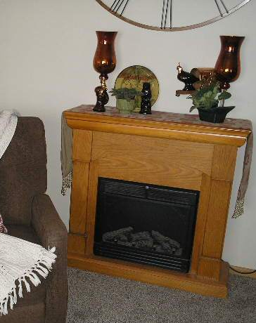
Set a plant most anywhere and add a few favorite pieces with it.  Here, we’re using the MAGIC #3 Rule of Display; 3 different objects, 3 different textures, 3 different weights and heights.  Three items are always a great way to start any display, then it’s easy to go from there!

The above plant (variegated hoya) provides it’s own three, with light and dark, and white sprinkled leaves.  This plant can also produce cream colored leaves.

USE WHAT YOU HAVE.  I’ve had this versatile baker’s rack in three homes.  Here it helps me group big plants in one space, for light and easy watering.  But small plants work too.

These two are African Violets.  They need light but not bright sun.  More importantly, they need to be kept damp … NOT dripping but, damp.

And below is a simple (but super) philodendron.  It takes quite a bit of abuse.  Throw a little water on it, once or twice a week, give it a little light and room to grow.  Mine is supported with a little metal stand (thrift store find), but a simple wood stake or branch will work too.


Nature items i.e. wood pieces, stones and collected items, work especially well with greens – but just about any other color too.  Pick up several color cards at your favorite paint supply store.  Then shop your home for decor items, fabrics (even scarves from your closet).  Put all together and just live with them for awhile.  It’s a great way to start and then take it from there . . . when you’re ready.


I owed you all a long post, as it’s been quite a while since we connected.  I always enjoy your thoughts, questions and comments . . . BUT BE SURE to mark the box below the post, to receive follow-up comments.

Later – Cheryl

Easy Color Schemes … for anyone to use

Choosing colors to use in your home? Does the very thought of it put worry wrinkles on your brow or get your stomach growling? Would it be easier if you only had to pick one color … just one?

For those who worry and fret over paint color decisions, a monochromatic color scheme is an easy and safe design approach. This simply means choosing ONE COLOR, but then working with several tints and shades of it, to provide your differences and interest. Below is a wonderful example.

Beautiful design here. Notice how interest is brought in with varied patterns and textures, which is another way to enliven any room, but especially with monochromatic schemes.

It’s almost that easy … but not quite. You need to be aware of two factors for any color schemes, but especially with monochromatic. Be conscious of and able to recognize that every color has a warm and a cold version, and for the most part, colors from one don’t work well with those in the other category. Coincidentally, individuals tend to prefer either one or the other.

And wherever you are painting, first make note of the lighting options in all of your areas. Windows come to mind immediately, but also notice which directions the window’s light comes from, and at what time of day it is most effective. Also remember your mechanical options; overhead and cans, lamps and task lighting.

Above they’ve chosen to use the same color on every wall area, and bring in the lighter and darker tones with accessories. A beautiful look, but the room would also be a perfect candidate for a more developed monochromatic scheme. The recessed alcove and it’s interesting layered opening are perfect opportunites for varied tints and shades of the main paint color.

A MCS works in rooms of any function and size.

This bathroom is a great example of how to utilize a monochromatic scheme. Here literally everything is rectangular, the shape of the room itself and all in it. This could be boring and bland, or overdone with too many colors. But by distributing tints and shades of gray, each area has it’s own identity yet nicely cohabits with its’ companions. Don’t miss the textures featured here. The very subtle color variances in the larger shower surround tiles. The shiny glass, smaller subway tile of the backsplash. The walls in different tones, and the dark wood vanity that grounds the room. Look closely and you’ll see a very small design in the flooring. A great way to accent everything AND unite the room, is their use of the strips and borders of smaller, dark gray tiles. Very nice.

How about a different color. Granted, purple isn’t for everyone, but below shows a good way to place your tints and shades; darker colors in brighter lighted areas and vice versa.

Note here that in the brightest corners by big windows, they’ve used the darkest shade of their color. The mid tone is mid-room and the lightest is in the bed alcove and on the ceiling. Very dramatic use of purple here. I applaud their bravado.

Below is a dramatic corner in a monochromatic room.

This isn’t my preferred look or style, but it is a nice area, and great use of a MCS. I especially like the ceiling treatment, with different colors on molding and walls. Details: note the interesting level at which the draperies are hung; the fun textures in the rug and pillow. And the varied patterns and piping of the chair. Even the decorative accessories on the side table coincide with the scheme, in textures and colors.

How about a few living rooms?

Very nice.

Yes, above is a gorgeous MCS, exquisitely designed. But wouldn’t you just love to plop a big, bright colored something on that table at the far window, if only just for shock value? (Am I bad?)

One more bedroom.

I have this room in more than one of my HOUZZ ideabooks. I just feel good instantly, every time I find it. But it is also a great example of a MCS. It’s lovely and looks so comfortable. Just what a bedroom needs.

Open floor plans are in so many homes today, either by new design or through remodel. The concept is very popular, and a huge selling factor. There are several reasons why I recommend using monochromatic schemes in these spaces. For builders, MCS can be both neutral enough to not be offensive to clients, but still interesting enough to be eye-catching, worth remembering. Any home for sale, whether new or existing, has to give the prospective buyers something great to remember when viewing so many properties.

A monochromatic scheme is also much easier to work with, for first time, or inexperienced home owners. Tackling large spaces such as those above, can be worrisome for anyone, even decorators. This area has so many wonderful details in its’ design, that paragraph upon paragraph could be written.

Instead, have some interactive fun. You tell me. How does this demonstrates a monochromatic color scheme? What details, textures and colors do you see here that work so well? Or perhaps you don’t feel this IS a workable space for you. If so, why not? Comment below and lets get a discussion going!

Meanwhile, don’t stress too much about any project, just start and things will evolve.

Later – Cheryl

Thanks for visiting. You’ve just read “Easy Color Schemes” my original article, first seen on Artzzle.com. I love comments and questions so send “em” my way. And be sure to spread the word about Artzzle to your friends. The more the merrier!

Copyright © 2013 Artzzle All Rights Reserved

Remember, all content on Artzzle, text and photography, is copyrighted and cannot be used in any form, without my expressed permission, or approval from material’s originator(s). You can leave a comment below with any questions on this.