Is It Time . . . to Color Things Up?

This was one of MY favorite posts from 2018, so am showing it off again 😀
When I pull out a flip chart of paint cards, sometimes the reactions are alarming.  So many people are intimidated … literally afraid of using color, and to them, thinking about all those choices is frightening.
Going to completely the opposite direction, let’s consider WHITE.  Take a look at this little post from Daily Dream Decor that I found over on Bloglovin.

7 All white spaces you will lust for

There are some great ideas here, but if that were the whole house, someone would have to lock me away in a private little white room!  😀
Rental apartments are notoriously painted in white or very light neutral colors.  That’s an easy way to ease into color.  The way to do that is with accessories.  Below, they’ve used naturals (dark wood & plants) and a trio of golds, oranges, browns and greens in the accessories.  So the “all white” room looks wonderful, not boring.
Decor gets braver in the living room below, where they’ve used color on the permanent pieces, i.e. couch and chair.  White remains predominant on the walls & ceilings, the rug, lampshades and even the plant and framed art.   But NOTE the window sheers are coupled with a slightly deeper neutral, a beige that works into the orange toss pillows.   Finishing touch is the deeper tones of the vase and flowers.  Everything inside also tends to play nicely with the outdoor view.
Dark floors give light neutrals life and ground the room.  Here other accessories in similar shades as the floor, help pull your eyes through the room.  Here again, a fun large plant adds additional color to the room, as well as texture and interest.
The living room below is much braver.  The dark floor color continues up the wall in the fireplace surround. The gorgeous green really livens up the room and is repeated in the area rug.   The third color orange is a great accent to all.  NOTE how wonderfully the art work and metals unite it all to produce a great look.
A totally different affect is seen in this final shot.  The ceiling has been painted in a dark color, and the majority of the floor is light, covered partially with the geometric rug.   Lively colors and textures add interest throughout, with the art, lamp and coffee table tones.  NOTE how the dark plant and white vase take your eye down to the black & white rug, which of course reminds you of that ceiling.  The green pieces add fun, with the turquoise and green glass the wow factor.

Black and white sprinkled through a room help give the eye a break, a resting spot.  This tip works in display too.

Whether you’re a “white wall” person or someone beginning to experiment with color, I hope you’ve enjoyed my post.  I love comments, so let me know what you think.

Until next time.

Cheryl


Continue reading

Colors, Whites and What’s Right for You

This was one of MY favorite posts from 2018, so am showing it off again 😀
When I pull out a flip chart of paint cards, sometimes the reactions are alarming.  So many people are intimidated … literally afraid of using color, and to them, thinking about all those choices is frightening.
Going to completely the opposite direction, let’s consider WHITE.  Take a look at this little post from Daily Dream Decor that I found over on Bloglovin.

7 All white spaces you will lust for

There are some great ideas here, but if that were the whole house, someone would have to lock me away in a private little white room!  😀
Rental apartments are notoriously painted in white or very light neutral colors.  That’s an easy way to ease into color.  The way to do that is with accessories.  Below, they’ve used naturals (dark wood & plants) and a trio of golds, oranges, browns and greens in the accessories.  So the “all white” room looks wonderful, not boring.
Decor gets braver in the living room below, where they’ve used color on the permanent pieces, i.e. couch and chair.  White remains predominant on the walls & ceilings, the rug, lampshades and even the plant and framed art.   But NOTE the window sheers are coupled with a slightly deeper neutral, a beige that works into the orange toss pillows.   Finishing touch is the deeper tones of the vase and flowers.  Everything inside also tends to play nicely with the outdoor view.
Dark floors give light neutrals life and ground the room.  Here other accessories in similar shades as the floor, help pull your eyes through the room.  Here again, a fun large plant adds additional color to the room, as well as texture and interest.
The living room below is much braver.  The dark floor color continues up the wall in the fireplace surround. The gorgeous green really livens up the room and is repeated in the area rug.   The third color orange is a great accent to all.  NOTE how wonderfully the art work and metals unite it all to produce a great look.
A totally different affect is seen in this final shot.  The ceiling has been painted in a dark color, and the majority of the floor is light, covered partially with the geometric rug.   Lively colors and textures add interest throughout, with the art, lamp and coffee table tones.  NOTE how the dark plant and white vase take your eye down to the black & white rug, which of course reminds you of that ceiling.  The green pieces add fun, with the turquoise and green glass the wow factor.

Black and white sprinkled through a room help give the eye a break, a resting spot.  This tip works in display too.

Whether you’re a “white wall” person or someone beginning to experiment with color, I hope you’ve enjoyed my post.  I love comments, so let me know what you think.

Until next time.

Cheryl


Continue reading

Monday has Mentionables

Monday seems a manageable day to mention magazines.
(Ooh, I just love all those “M’s”).
My “Drafts” files contain several notes and starts
regarding my appreciation of these printed papers.
Always wanting to give you great stuff on Artzzle,
I find magazines offer valuable material on varied décor topics.
Which is after all, primarily what Artzzle is all about.

Artzzle.com Magazine Mondays

Regular readers have been so patient with me … thanks guys 🙂
You all know I’ve tried various “themed days of the week” …
and you’re also aware that continuing those for any length of time,
hasn’t been a strong point for me.

Searching the blog will demonstrate that, to everyone.
Friday Features”, “Whatever Wednesdays” … “Fun Finds” and so on.
Good articles but I never got in the groove of a serial series.

Quite a bit earlier in my blog history, I considered Magazine Monday
… but wouldn’t ya’ know, my blogger buddy BLISS,
started a similar theme at that point.
Good bloggers like to communicate, share and feature fellow bloggers,
but not steal ideas … as some have done.
And YES … even some of the Big Names.
I didn’t want her to feel I was being improper
so I dropped it … until now.  I don’t think she’ll mind,
especially since only the titles are alike.
Our approaches and info are unique to each person.

Magazines AND catalogs, have always been present for me;
in my mother’s household, and through the years, in each of mine.
And take “present” very literally here.
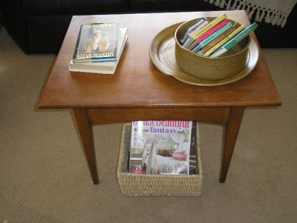
Walking through our home, you’ll find them in almost every room

Artzzle.com Monday Magazines

  In the living room (at Mom’s it was always called the Front Room).

Artzzle.com Monday Magazines

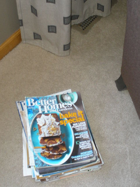
There’s a pile or two in the family room …

Artzzle.com Monday Magazines

including some of Hubs’ subs too!
The tray pictured pictured, was a project you’ll find HERE

Artzzle.com Monday Magazines

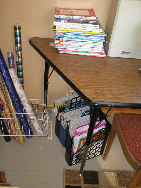
 Tons are stacked  ahem … filed … in my office/studio.
The guest room is messy at the moment, so no show.
But yes, there is a nice rack of books AND magazines in there.

Finally, of course … I have to have
available reading in the master bedroom.
Great for those less sleepy evenings,
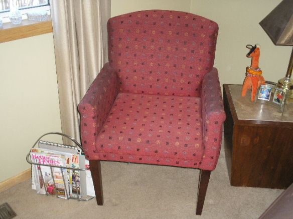
or the bright, sunny mornings in my chair
with that first cup of coffee … or two or three.
Ya know I gotta have my coffee!
Hey … isn’t that little orange giraffe a cutie. More about him at a later date.

Magazines, living room, workroom, family room, master bedroom

Now, neither Hubs or I require reading material with bathroom seating.

Funny story though.  My Uncle Bob was a favorite of mine.
He passed away last October at age 86, and we all miss him.
Uncle was an over-the-road truck driver for years,
which meant three things:
#1. Their family moved quite often as his employment changed.
#2. Bob detested public restrooms, and all those grubby,
closed in, gas station bathrooms.
#3. In every home they owned, Uncle Bob had a special,
second bathroom just for himself.

Oh, anyone could use it … in an emergency.
But each day, as regular as a sunrise,
he would retreat to his “room”.
Let’s just say for an extended period of time;
sometimes with a cigarette or cigar, and depending on the time of day,
possibly with a can of pop or beer.  (I know … gross, right!)

Point here is, these special spaces of his ALWAYS HAD a magazine rack.
Being a huge sports fan, one might have thought he’d include a TV as well,
but no, only the mags.  He had another special room for his own TV!
And, gotta tell ya, NOBODY INTERRUPTED Bob in either room!
When he wasn’t around and someone would ask his whereabouts,
we’d laugh and say “the King is on his throne”.

I am going to try … very hard, to see how long
I can keep the Monday Magazines a regular feature.
Meantime, our kitchen projects continue,
so look for more updates later this week.

As always, don’t stress too much about a project,
just start and it’ll take off from there!

Later – Cheryl

Sunday Scenes

Sunday has provided time . . . to consider thoughts of many kinds.

A mid- summer Sunday
Trees swing and sway
Clouds intermittent, white to gray

ARTZZLE.COM

***

My living room has creams and browns
and lots of straight lines can be found.

ARTZZLE.COM
Seeing below, I want some rounds
And need to add more color!

BHG August PublicationSource:  Better Homes and Gardens Magazine, August Issue

***

Saw my girls yesterday
Realized how time slips away
ARTZZLE.COM

From little ones to keep in tow
See how quickly they did grow.

OLYMPUS DIGITAL CAMERA

***

Here’s one more pretty for you today
Then I must be on my way 🙂

ARTZZLE.COM

Glad you stopped by again.
Remember now, don’t stress too much, just go ahead with something.

Later – Cheryl

*** This original article “Sunday Scenes” appeared first on Artzzle.com. No included content or photography can be used elsewhere without specific permission and accreditation from contributors. Outside sources are marked when available.

Copyright © 2013-2014  Artzzle All Rights Reserved

B4 and Afters!

We like seeing pictures on blogs … pictures … pictures … and MORE PICTURES, right!

Some of the most popular and requested items are photos of Before and After’s. Today’s post has a bit different slant to the B&A idea. You’ll see during Christmas and then the afters, the January Jazzed-Up look. See what you think.

NOTE: HOVER GALLERY PICTURES for CAPTIONS; CLICK for SLIDESHOW.

The painting stayed in place and was left as-is. Often times, I wrap my larger art pieces in holiday paper to connect them to the rest of the décor. Such as in a previous season … below.

A

But remember, I had a minimal look going, so didn’t cover anything here. I was just less enthused this time … OK, yah … a little lazy!

This corner shelf is always a “reader favorite”, wanting to see the newest displays there. Here are two holiday looks and the January display.

Here are some looks at the cupboard tops. It’s hard to get everything into one picture.

Holiday this past season.

The Jazzed Up look isn’t too jazzy yet. Kind of bare, but I’m still in contemplation mode.

The wall by the front door always has a display of three items.
Two during various Christmas displays and the January look.

Before I leave, did you happen to notice the new chairs in the living room? They’re “new-to-me” pieces that I found on Craigslist. Located in the south suburbs close to my son’s place, he picked them up for us. We took them home on our Christmas visit … and BIG SURPRISE … son & his lady made these our present (so no payment needed). Yay! Thanks.

This last gallery will show you the entire LR from corner to corner, beginning in the SW corner with the shelves, and going to the right and around the room. The “new” chairs are on each end of the sofa.

HEY, are you are curious about the price of those “new to me” chairs?
Say yes … say yes! (It was UNBELIEVABLY low)
Send me a reply in the comments section, and I’ll give you the low-down.

Until next post, as always, try don’t stress but get started on something.
Later – Cheryl

This original article “B4 and Afters” appeared first on Artzzle.com. No included content or photography can be used elsewhere without specific permission from said originators.

Copyright © 2013 Artzzle   All Rights Reserved

Room Tour

It isn’t a very mobile Monday as my back remains out of whack, but I don’t like to miss a post. Recently I’ve gotten some requests to feature our place in a home tour, so thought this might be a good time to put some of those pictures out there. Today the light was decent for getting some living room shots so that’s what I’ll share this time.

Artzzle.com

This angle is looking into our living room from the kitchen.

Our house is a basic one level. In Minnesota it’s called a rambler, but is also sometimes referred to as a ranch style. The main living areas of the house flow into each other, in a very open floor plan. This includes a living room, dining room and kitchen, and on into a family room.

Artzzle.com

You’ve seen this shelf piece before. We purchased it several years ago at Crate and Barrel. Such a versatile unit, it can be on a flat wall, up against a corner wall or straddled across a corner as it is here. You can also pair it back to back with an identical shelf for a nice look. We’ve even used ours horizontally on the floor as well. The two glass owls in this display are from KOHL’s (a birthday gift). Except for the photography and plants here, everything else is from thrift stores or garage sales, and was purchased for next to nothing (including the Hull, Frankoma and noemi pottery pieces).

The blue metallic piece is simply a small table from an outdoor patio set. It holds our electronics and a little basket for movie storage. The open leg area makes a perfect spot for extra toss pillows too.

Artzzle.com

This is a small credenza piece, circa mid 1960’s. It was one in a set of three tables in my mom’s home; a brown, wood-look formica style popular at that time. I have redone this table three times. This treatment is my favorite as I used metallic copper paint to resurface the top and hardware, and added a light texture treatment to the paint in the body of the piece. Formica can be easily and economically redone. I love this credenza because its’unique shape and size can be used in so many places, and it was a special piece to my mom.

Artzzle.com

The art piece pictured here is something I painted several years ago. I just plotted out a geometric layout that I liked. It is painted on masonite, simply using latex wall paint. Then the blocks were outlined with a copper paint pen. Over time, as I change colors in my houses, these colors change as well. The piece is designed to hang either horizontally or vertically as featured here.

The orange lamp, petite coffee table and its’ accessories are all thrift store finds. $7.00 for the lamp (new with tags), $10.00 for the table and $.75 for the scarf (which is an original Vera Wang textile). The copper tray was under a dollar.

Artzzle.com

Our living room is wonderfully workable for several layouts. The couch out into the room as it is here, is one of our favorite arrangements. We also like our hutch across the angled walls as you see here.

Artzzle.com

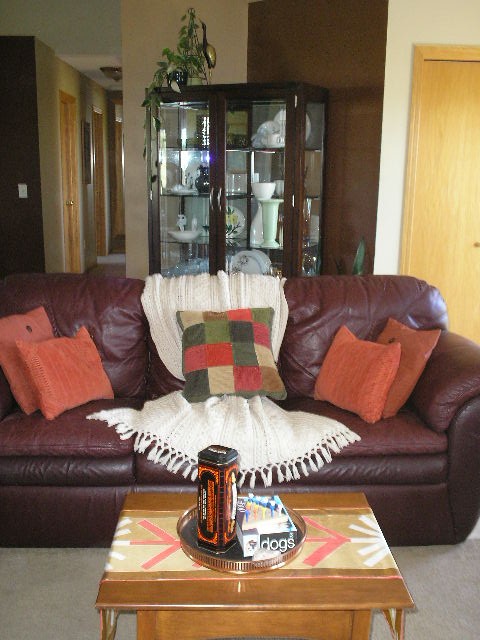
The larger, square toss pillows are in indoor-outdoor fabric, and were purchased new at Wal-Mart for $4.64 each. I liked the design and durability, especially with our pets. The orange and patchwork corduroy pillows are part of a comforter set that I found at a garage sale recently. The material washed up quite nicely and is very durable. And by using some of the items in different rooms, it helps unite the spaces.

Finally pictured is Hubs’ favorite chair. Let it be known that a man is not easily separated from his electronics OR his favorite chair. I can hear someone saying “that looks like one of those vinyl sets you used to buy at big box stores”. Yes it does look like those, but it has a special story. In the late 1990’s I worked for Dayton’s, a wonderful upscale store in Minneapolis. At that time employees got fantastic discounts, and even more so twice a year during their “employee appreciation days”. Hubs fell in love with this chair, which was an exclusive design, in leather, imported from Italy. We had never seen anything like it. Even with my discounts, it was pretty spendy for us, but I wanted him to have the chair. Fortunately for some, but unfortunately for us, within a year’s time, there were vinyl knock-offs of this design in every big box store around, going for about $99. The only proof we have of its’ authenticity is that it is nearly 20 years old, and still looks and feels like new.

Artzzle.com

The three framed items were made with dollar store picture frames. I removed what was originally displayed, lined the back with black velvet, and then arranged several pieces of jewelry that had belonged to my mom, my aunt and my grandmother. The lamp is another thrift store purchase @ $5.00. TIPS: Always inspect wiring on these lamps; you don’t want dried out, or taped cords, or cracked cords or switches. Take a light bulb with you on your thrift trips, to test the lamp before you buy. REMEMBER, shades are easy to buy and or replace now days, so don’t pass up a great lamp base because of an ugly shade!

Thanks for stopping by today. Let your friends know we’re here. The more the merrier.

Later – Cheryl

Easy Color Schemes … for anyone to use

Choosing colors to use in your home? Does the very thought of it put worry wrinkles on your brow or get your stomach growling? Would it be easier if you only had to pick one color … just one?

For those who worry and fret over paint color decisions, a monochromatic color scheme is an easy and safe design approach. This simply means choosing ONE COLOR, but then working with several tints and shades of it, to provide your differences and interest. Below is a wonderful example.

Beautiful design here. Notice how interest is brought in with varied patterns and textures, which is another way to enliven any room, but especially with monochromatic schemes.

It’s almost that easy … but not quite. You need to be aware of two factors for any color schemes, but especially with monochromatic. Be conscious of and able to recognize that every color has a warm and a cold version, and for the most part, colors from one don’t work well with those in the other category. Coincidentally, individuals tend to prefer either one or the other.

And wherever you are painting, first make note of the lighting options in all of your areas. Windows come to mind immediately, but also notice which directions the window’s light comes from, and at what time of day it is most effective. Also remember your mechanical options; overhead and cans, lamps and task lighting.

Above they’ve chosen to use the same color on every wall area, and bring in the lighter and darker tones with accessories. A beautiful look, but the room would also be a perfect candidate for a more developed monochromatic scheme. The recessed alcove and it’s interesting layered opening are perfect opportunites for varied tints and shades of the main paint color.

A MCS works in rooms of any function and size.

This bathroom is a great example of how to utilize a monochromatic scheme. Here literally everything is rectangular, the shape of the room itself and all in it. This could be boring and bland, or overdone with too many colors. But by distributing tints and shades of gray, each area has it’s own identity yet nicely cohabits with its’ companions. Don’t miss the textures featured here. The very subtle color variances in the larger shower surround tiles. The shiny glass, smaller subway tile of the backsplash. The walls in different tones, and the dark wood vanity that grounds the room. Look closely and you’ll see a very small design in the flooring. A great way to accent everything AND unite the room, is their use of the strips and borders of smaller, dark gray tiles. Very nice.

How about a different color. Granted, purple isn’t for everyone, but below shows a good way to place your tints and shades; darker colors in brighter lighted areas and vice versa.

Note here that in the brightest corners by big windows, they’ve used the darkest shade of their color. The mid tone is mid-room and the lightest is in the bed alcove and on the ceiling. Very dramatic use of purple here. I applaud their bravado.

Below is a dramatic corner in a monochromatic room.

This isn’t my preferred look or style, but it is a nice area, and great use of a MCS. I especially like the ceiling treatment, with different colors on molding and walls. Details: note the interesting level at which the draperies are hung; the fun textures in the rug and pillow. And the varied patterns and piping of the chair. Even the decorative accessories on the side table coincide with the scheme, in textures and colors.

How about a few living rooms?

Very nice.

Yes, above is a gorgeous MCS, exquisitely designed. But wouldn’t you just love to plop a big, bright colored something on that table at the far window, if only just for shock value? (Am I bad?)

One more bedroom.

I have this room in more than one of my HOUZZ ideabooks. I just feel good instantly, every time I find it. But it is also a great example of a MCS. It’s lovely and looks so comfortable. Just what a bedroom needs.

Open floor plans are in so many homes today, either by new design or through remodel. The concept is very popular, and a huge selling factor. There are several reasons why I recommend using monochromatic schemes in these spaces. For builders, MCS can be both neutral enough to not be offensive to clients, but still interesting enough to be eye-catching, worth remembering. Any home for sale, whether new or existing, has to give the prospective buyers something great to remember when viewing so many properties.

A monochromatic scheme is also much easier to work with, for first time, or inexperienced home owners. Tackling large spaces such as those above, can be worrisome for anyone, even decorators. This area has so many wonderful details in its’ design, that paragraph upon paragraph could be written.

Instead, have some interactive fun. You tell me. How does this demonstrates a monochromatic color scheme? What details, textures and colors do you see here that work so well? Or perhaps you don’t feel this IS a workable space for you. If so, why not? Comment below and lets get a discussion going!

Meanwhile, don’t stress too much about any project, just start and things will evolve.

Later – Cheryl

Thanks for visiting. You’ve just read “Easy Color Schemes” my original article, first seen on Artzzle.com. I love comments and questions so send “em” my way. And be sure to spread the word about Artzzle to your friends. The more the merrier!

Copyright © 2013 Artzzle All Rights Reserved

Remember, all content on Artzzle, text and photography, is copyrighted and cannot be used in any form, without my expressed permission, or approval from material’s originator(s). You can leave a comment below with any questions on this.