FINALLY . . . I think it’s safe . . .

We can start planning “Spring”!  Just a week ago, we got 14 inches of snow.  Depressing 😦

OLYMPUS DIGITAL CAMERA

This weekend, while we do have a little extra water here and there …

OLYMPUS DIGITAL CAMERAOLYMPUS DIGITAL CAMERA

things are perking up with buds

OLYMPUS DIGITAL CAMERA

OLYMPUS DIGITAL CAMERA

and even a little green here and there!

OLYMPUS DIGITAL CAMERA

Just now, I found the perfect HOUZZ article for Hubs and I, and it is so helpful that I want to share it with all of you.

I’m convinced many of you will like it too.  Leave a comment and tell me what you think.

Meanwhile, let me know how you’re welcoming Spring 🙂

Later – Cheryl


A Little Work While Waiting … for SPRING.

Yesterday was gorgeous here and revived spirits and senses.  Even though it’s still March in Minnesota and could snow like mad again any moment, one day of warm weather and walks outdoors does amazing things to a person.  I decided to “Spring” things up around here and got to work.

The credenza shelves in the hallway entrance were changed from this look, which has been up since Christmas was stored away.

OLYMPUS DIGITAL CAMERA

BEFORE

I thrifted some wonderful dishes recently, and the colors steered me towards light blues and whites.

OLYMPUS DIGITAL CAMERA

AFTER

OLYMPUS DIGITAL CAMERA

The new arrangement has those dishes with some of my mid-century Japanese blue ware, and several of my glossed white figurines.

OLYMPUS DIGITAL CAMERA


OLYMPUS DIGITAL CAMERA

Newer Artzzle readers and followers may not know that I have lots of favorite things that have been collected over time.  Plates, pottery and miscellaneous decor items, just to name a few.  And I know a couple people who would say I bring home “anything I fall in love with”.  Well … ?  One of my other favorite things is thrifting which doesn’t help!

Plates and pyrex, creamer/sugar sets and salt/pepper sets are just a few items I love.

We live in a small home and like things to be straightened and uncluttered.

Artzzle COUNTRY LIVING Feature

I should probably say that we need to keep it that way, because there’s not much free space available for stuff.  Now although I’m not a hoarder, I do have me some stuff.  So we’ve had to be inventive.  I’m a stager/decorator and among my Husband’s many talents is woodworking.  Between the two of us, we’ve redesigned all of our closets to better utilize our spaces, and Hubs has made several shelves for displays throughout the house.  These wonderful features allow me to change out displays as often as the urge hits me!

I designed this shelf to fit beneath the cabinet bottom.  The shelf itself, has two grooves cut lengthwise, to hold several plates.  Also, the width is deep enough to hold cups, small bowls and decor items (see earlier picture).  We then added cup hooks on the bottom of the shelf for a different display look.  This takes up very little space (great for apartments as you can take it with you), and keeps my counters clear.

OLYMPUS DIGITAL CAMERA

The front door, with its’ new coat & color of paint, got an Easter Look for Spring.

OLYMPUS DIGITAL CAMERA

And scattered about . . .

OLYMPUS DIGITAL CAMERA

are smaller glimpses . . .

OLYMPUS DIGITAL CAMERA

of Easter and Spring.

OLYMPUS DIGITAL CAMERA

I know many of you have small apartments or smaller homes such as ours.  How do you use your spaces to display your treasures?

Just want to give a big HELLO & WELCOME to recent new followers.  I love hearing from you so feel free to leave a comment.  Know that you need to mark the box for follow-up comments.

Have a wonderful Easter weekend.  We’ll talk again soon.

Later  –  Cheryl


March Means Greens

     If you don’t already know  . . .  I’ll tell you now, March is my least favorite month.            I’d prefer to skip it entirely and go straight to . . .  April.

This year, I’m trying to kick myself in the rear, and steer clear of the doom & gloom.  March is associated with many things green, so let’s put some of them in a room.

People associate greens with landscapes, and that may be why they feel comfortable using those colors in their home.

A light wallpaper and darker accents are fun here.

A larger concentration is used below.  Notice they’ve chosen a monochromatic scheme.   This is where varied tints and shades of one color are used.  This can be done gradually for the hesitant decorator.  Choose one color you enjoy, and work it throughout your space, using light to medium tones, then darker as you become more confident.

The idea of any saturated decor colors is frightening for many of us, though.  Greens are not the first choice on my walls either.

Our home has a very open floor plan.  Entering the front door, you are immediately in the living room, from which you can also see through the dining room, into the family room, and down a hallway to the private areas.  This room (below) and down the hallway, are done in a light, neutral; a custom color I have used for years in other homes as well.

Neutrals’ accomplishments are many.  Here, it provides a clean look, a feeling of spaciousness and light, and is a wonderful backdrop for large art pieces.  Finally, it visually leads your eye down the hallway, and out to the adjoining rooms.  Your rooms should “play nice with each” 😀 , and continuing colors helps unite them, giving your spaces a comfortable flow.

Longtime readers and followers know that I’m NOT afraid of bolder colors and deep tones, but I have a definite plan with all colors as they play throughout my home.

If you are a neutral person, or just not ready for prime time, take baby steps and do a little experimenting, using accessories for your color and interests.

Greens are such fun to work with, and as noted, are the colors of nature which often puts people at ease.  The easiest green in decor is PLANTS.  Easy as 1-2-3 … colorful, affordable and moveable.  (And easy to replace if you have a brown thumb 😦  ).

Set a plant most anywhere and add a few favorite pieces with it.  Here, we’re using the MAGIC #3 Rule of Display; 3 different objects, 3 different textures, 3 different weights and heights.  Three items are always a great way to start any display, then it’s easy to go from there!

The above plant (variegated hoya) provides it’s own three, with light and dark, and white sprinkled leaves.  This plant can also produce cream colored leaves.

USE WHAT YOU HAVE.  I’ve had this versatile baker’s rack in three homes.  Here it helps me group big plants in one space, for light and easy watering.  But small plants work too.

These two are African Violets.  They need light but not bright sun.  More importantly, they need to be kept damp … NOT dripping but, damp.

And below is a simple (but super) philodendron.  It takes quite a bit of abuse.  Throw a little water on it, once or twice a week, give it a little light and room to grow.  Mine is supported with a little metal stand (thrift store find), but a simple wood stake or branch will work too.


Nature items i.e. wood pieces, stones and collected items, work especially well with greens – but just about any other color too.  Pick up several color cards at your favorite paint supply store.  Then shop your home for decor items, fabrics (even scarves from your closet).  Put all together and just live with them for awhile.  It’s a great way to start and then take it from there . . . when you’re ready.


I owed you all a long post, as it’s been quite a while since we connected.  I always enjoy your thoughts, questions and comments . . . BUT BE SURE to mark the box below the post, to receive follow-up comments.

Later – Cheryl

A Season Of Celebration

It’s Spring. Everyone’s happy about that.
I know many of you are sighing in relief,
and probably thinking “It’s about time!”

This welcomed season is a time of many celebrations.
Simply, joy for the weather changes and Spring breaks.
Seriously, the observances of Easter and Passover.

Artzzle Spring Feature

This photo lifts my spirits with each view.
I’m hoping it’s as uplifting for you.
Have a wonderful holiday.
I’ll be back this way . . . soon.

Later – Cheryl

Have You Said the “S” Word Yet?

It’s another bright day.  Hope your’s was also.  Anyone else thinking the “S” word yet?

Well, not to jinx it, but with all this color thought of late, these warm days just naturally stirred up yearnings for a seasonal change.  I just couldn’t help myself … had to do a little Spring decorating.

This week I spruced up the living (front) room, changing out the door wreath, shelf unit and the mantel.

My “Wreath for All Seasons” was hanging, lonely and bare, after the reds of Christmas and Valentines were removed.

Enough spring stuff was found in the craft room, to liven it up quite a bit.

Artzzle Spring Feature

It seemed a little early for roses … so I didn’t include them.

Artzzle Spring Feature

I was happy with the results.  How about you?

Remember,  this wreath was specifically designed to be changed out for different occasions, so all pieces are attached lightly, with double sided tapes, or just wired in to the original frame; allowing for quick and easy change out.  You all know how changeable I am.

The fireplace … in its’ new location now, under the big clock, looked like this earlier.  I was never completely satisfied with this vignette.

Artzzle Spring Feature

I made a raid on my fabric remnants and found this pretty green piece to ground things.  From there a little house shopping and some experimenting produced this look.

Artzzle Spring Feature

It says “Spring” don’t ya think?

The plate holder by the front door, got a color change with the green plate, and a few butterflies came over to play.

Artzzle Spring Feature

On the standing shelf unit currently in that room, once again the reds of previous holidays were removed, and we went towards the blues and greens to liven up that corner.

Artzzle Spring Feature

The JAW takes top shelf here.

Greenery and the Easter Bunny are a bit springy.

Artzzle Spring Feature

What’s your reaction to the JAW?  I note that it’s a 50/50 swing … people either love it or detest the thing.  Such was the playout when I found it.  A friend and I were at a barn sale, and I immediately HAD.TO.HAVE.IT.  She, on the other hand, thought it was weird … but she’s used to me, and knew I would get it. It was just the jaw piece. I had HUBS use some gorgeous walnut for a base, cut two brass rods and drilled everything out for a perfect fit. The walnut block was left natural, but mineral oil was rubbed in for that beautiful dark dazzle.

Well, a pretty short set today.  Lots of articles in the works, so I’ll  be back soon.

Artzzle Feature Spring

Gracie loved the sun this day. Say goodnight, Gracie.

You know what happens now … I say “Don’t stress so much, just start something!”

Later – Cheryl

Color … Color … and MORE Color

Not intending to make any of you jealous, I have to share that, it’s been so sunny around here today, and for quite a few days back, too.

ELLE DECOR Magazine has a monthly article “SHORTLIST” which features a quick update on a celebrity, and then lists 12 Things they (supposedly) can’t live without.  My list would, for sure, have Sunny Days and Color on it … and probably close to the top!

Is there anyone out there, that isn’t energized and more positive on a bright, sunny day? That’s not unusual.  Bright, beautiful colors have a similar affect on me.  A classic room, a beautiful fabric, a big, bold painting.  Just thinking about color makes my eyes light up and I sigh with pleasure!  See if you’ll have as much fun as I did OVER HERE!

Spring is coming and that in itself says color; with early blossoms and
Artzzle Feature on Color

with seasonal decor and just brightening things up to phase out those winter blahs.

ARTZZLE.COM

Find this easy project here

Colors cause definite physical reactions for many people, including both Dugger and I.   Our former Princeton home was a multi-level.  The lowest area had two separate wall areas, because of a ledge around the entire space, so we chose two colors (blue-green tones) for the builders to paint. The colors were very nice … most everyone said so.  But the area was never comfortable to us.  It literally felt COLD and unwelcoming; not good for a family room, right!?  So we (I) repainted the entire area, again in bluish-green hues, but in warmer tones.  Some people just thought we were nuts.  A new house, freshly painted, why bother with all the extra cost and work?  It looked fine … BUT NOT TO US.  It didn’t feel right.   Afterwards, it became one of our favorite and most used parts of the home.

We both are very happy with the color used in our recent kitchen cabinet project.  So much so that we’ve decided to take it throughout the house, and change out all of our builder basic, orange oak woodwork.

Kitchen Cabinet Uppers Redo

See the entire project here.

No decision yet, if we’ll add extra trim details on all of our flat panel doors … as Hubs did on the inside of our bathroom door last year.

Artzzle Feature

See the whole project here

Concerning lists, topping our primary “to do” sheet is an update for the master bedroom. I’ve been pouring over color shots and paint chips. Hubs and I lean towards browns, taupes and beiges, especially in our open living areas.  We’re both comfortable with warm neutrals and these work great for all the changing and rearranging I do.

For inspiration AND a perk-up, I often use the IMAGES tag on-line.  Wondering about green tones, here’s what I pulled up in my research using GREEN BEDROOMS.  You could literally go on forever … different color rooms, two-color or multiple color rooms.  A nice time filler for a boring, in between time.

Our extra areas and bedrooms are done in brighter hues. We want these smaller, individual spaces to have a more personal look and feel, and as I said, I take “feel” quite literally.  My office/studio, pictured below, is a custom color, a peachy orange.  Even on cloudy days, the room is cheery.  It makes me smile every time I look in there.

Artzzle Feature

More on the office/studio and a PROJECT HERE.

If you’re not tired of internet articles yet, try one more here.   REAL SIMPLE TIPS

We’re tackling that master bedroom very soon, so follow along for all the updates.  In the meantime, don’t stress about your project, just get it started and see where it goes!

Later – Cheryl

GREAT ways WITH GRAYS

GREAT ways WITH GRAYS


Hi All.  How’s your Friday going?

Well, finally Spring has arrived . . . or at least is very close by.
While we’re all glad for better weather,
many are anxious for other changes as well.
At our house, we want to paint the main living areas.
Wait, let me rephrase that.
We both want new paint, but Hubs wants me to be the only one painting.

While we usually lean towards browns and beige,
since our BATHROOM CABINET PROJECT,
we’re going for grays.

So I’m heavy into research for gray combinations.

50scolor

True, gray tones are trendy right now.
But it’s not at all new in interior design.

In the 1950’s, gray was very popular combined with a dusty pink,
or with a low intensity turquoise.

Think “Poodle Skirts“.

ARTZZLE.COM

BETTER HOMES and GARDENS online,

BHGartzzle.com

has a wonderful article on how great gray is to use,
with nearly any accent color.

Here at our place we’ve decided on two tones of gray,
a light neutral and a mid-tone, darker shade.
As for accent colors, well . . . that’s gonna take a while yet 🙂

Have a great weekend and as always . . .
don’t stress too much, just start it.

There are lots of fun links today, so check them out!

Later – Cheryl

***
This original article “GREAT ways WITH GRAYS” appeared first on Artzzle.com. No included content or photography can be used elsewhere without specific permission and accreditation to sources.

Copyright © 2013-2014 Artzzle All Rights Reserved

Rabbits, Robins and Everything Easter

Can you say . . . SPRING

I can’t say it . . . without screaming and jumping up and down with glee!

Ribs are recovering … Snow is melting … Easter is approaching … and Robins are arriving!

ARTZZLE.COM

Today, I’m sharing everything Easter; a decor idea or two, how-to’s on one of my Make-Do projects and some great online finds from fellow bloggers.

So. . . here we go!

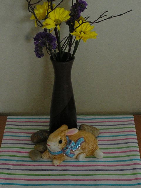
Back before the BIG FALL, I purchased an assorted bunch of flowers at WalMart for $7.99. The mixtures are versatile because divided up, they make several smaller bouquets, for more color around the house.

This particular bunch had all sorts of odds and ends in it . . . so I really had fun. (Sorry, I didn’t take a picture of the complete bouquet).

ARTZZLE.COM

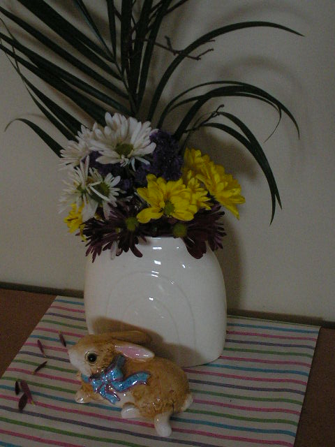
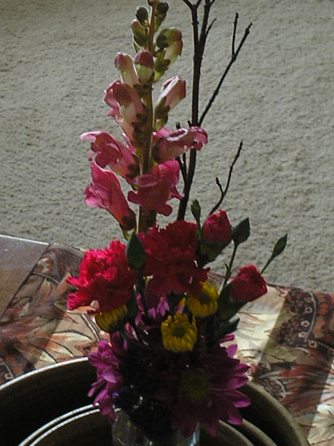
Above, I used the single frond of greenery and added daisies, small mums and purple stasis to a wide mouth vase. A cute bunny figurine and some pretty paper drape, brightened up my credenza.

Below, as flowers faded, the arrangement and vase changed.

ARTZZLE.COM

Included in the bunch, was a single lily branch, with several gorgeous blooms and buds. It was substantial enough to stand alone, needing no other flowers.

But on an end table, a pretty little box accents the yellows, greens and browns of the stem.
ARTZZLE.COM

I held the remaining blooms from the bouquet and “arranged them in my hand”, then wrapped floral tape around the stems to secure the group. Then I simply trimmed the ends of the stems and placed them in a little vase for a final arrangement.

TIP: If you don’t have floral tape, a rubber band or light wire will work. Wire tabs from your bread wrappers work well.

ARTZZLE.COM

TIP: The assorted mix bouquets at store stands range from $2.99 to $14.99, making the prices as versatile as the pretty flowers.

Sometimes it’s fun to just get all the same blooms and line them out across a table top, in similar vases.

There’s room for immense imagination here!
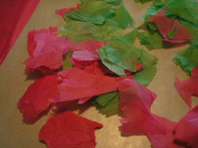
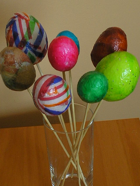
MAKE-DO EASTER EGGS

You may remember my “Pretty Gift Box” project, using glue and tissue paper.

That process is used today, on a package of foam eggs, with some colored tissue and ModPodge.

ARTZZLE.COM

I did use a few more tools:

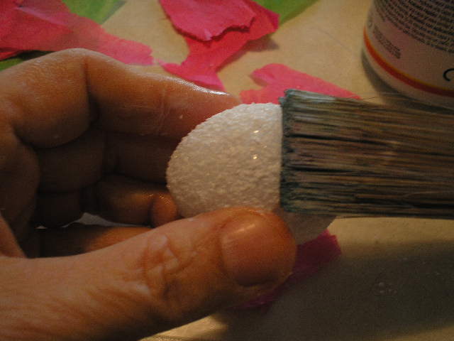
> a “throw away” 2 inch paintbrush
> a glass of water
> wax paper
> some long wooden skewers (like you use to barbaque)
> and two clean rags – one wet, one dry.

FIRST I tacked down a good sized piece of wax paper to my work table, to help contain the wet, glue as I worked.

The rags were to help keep fingers clean and dry when neccessary. The skewers allow you to hold the egg, making for easier handling as you glue.

NEXT, tear (just rough rips) small pieces of tissue paper. You don’t want straight, scissors cut lines here.

OLYMPUS DIGITAL CAMERA

Now, Lightly moisten tip of paintbrush, squeeze out excess water, dip tip of brush in modpodge and begin applying to BOTTOM of egg. ARTZZLE.COM

Put a piece or two of paper over the glue, brush flat onto egg.
OLYMPUS DIGITAL CAMERA

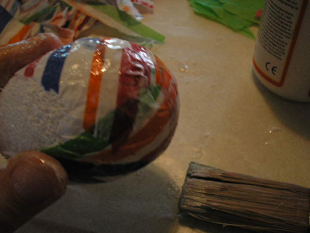
Now push skewer into this area of your egg. The stick gives you something to hang on to and makes the rest much easier to finish. Then just keep going, gluing and smoothing layers of tissue until egg is covered.
ARTZZLE.COM

TIP: Don’t insert the skewer into the bare foam egg before you begin. Always put a layer of paper on the bottom of the egg first, then insert the skewer over that. This way the paper won’t stick to the skewer, so you can easily remove it after drying.

While your eggs are drying, put them in a tall glass to avoid them sticking to each other.
OLYMPUS DIGITAL CAMERA

When the eggs are completely dry, carefully pull them off the skewer and use for your project.

ARTZZLE.COM

TIP: If you want to use eggs on a wreath, cut the skewer off about an inch from the bottom of the egg, and you will have something to insert into a foam or branch wreath.

Lately, online, there have been tons of pretty projects for Easter.

Easter-subway-art-free-printable1

These FREE PRINTABLES from HOW TO NEST FOR LESS are just two. But they’re so colorful AND so appropriate that I just had to share them with you. Thanks Erin.

jesus-is-the-reason-for-the-season-easter1

Before I close the post today, I want to express Sincere Thanks to those of you that noted concern and sent well wishes, after my little accident in March. It’s helping me heal faster, knowing that so many others are thinking of me. Much appreciated.

So, it’s time to say “don’t stress too much, just start something!”

And naturally, I LOVE COMMENTS so keep em’ coming! Thanks.

Later – Cheryl

This original article “Rabbits, Robins and Everything Easter” appeared first on Artzzle.com. No included content or photography can be used elsewhere without specific permission and accreditation.

Copyright © 2013-2014 Artzzle All Rights Reserved

Daydreaming of Spring Greens

Hi All.

Like a broken record, the winter weather goes on and on. And with two broken ribs, the discomfort continues on as well. So, I’m repeating a very early blog I posted from around this same time of that year. So many followers and readers have joined me since, so it will be new to most.

On the mend.
Later – Cheryl

ARTZZLE

The calendar says it is Spring but the weather keeps denying it. Recently, I’ve been daydreaming of all the beautiful greens of Spring. I thought how that color family is also a popular interior choice as well. Beginning decorators are especially drawn to warm greens, perhaps because we see those everyday in nature.

Greens are comfortable for guys and gals alike. They are great companions for woods, stone, ceramic and natural accessories. It’s also very easy to find coordinating fabrics that will also give you additional accent colors to use with your greens.

The featured group of three Benjamin Moore paint strips shows cool, mid-tone and warm greens. Cool green has more blue in color mixture. Mid-tones (brighter) are a more even mix of blue and yellow, and the warms have more yellow in the mixture. The lone strip is a Better Homes and Gardens sample and though not showing…

View original post 399 more words

Spring Arrived …but We’re Still Inside

Hi All.

Calendars say it’s Spring but weather has many of us still stuck inside . . . and our brains are fried . . . with boredom.  What I do for this malady, is rearrange, a lot!  It refreshes the spaces in your home and your mind. Best part is, it doesn’t cost anything!

Just be careful with heavy stuff.  You don’t want any ER trips for a back out of whack.

Today, I have hints on how to improve your furniture groupings.

Let’s pretend you’re looking at one of your main living areas, and you think “it’s not so bad, I like my stuff in here.”  But there’s just a little something off and you wish you could fix it.    Consider the area below, a conversation area in an average sized living room.

Nice things but they aren't communicating well.

Nice things here so what’s wrong?

Maybe because most of our first places are small, we want to push things out and use every inch of space when we graduate to bigger rooms. It’s almost a natural instinct, but spreading out dooms arrangements. The group above is dead because of the spread.

Tighten Up

Move pieces closer together, making it a more inviting arrangement.  Below, notice how we pulled the chairs closer together, angled them and centered things, table and all, under the wall clock.  This is a conversation area, but now you won’t have to yell across the room to converse!  Make your pieces communicate, so that your guests can too!.

Tightening Up

Add More . . . Sometimes

YES . . . me, the “no clutter” freak . . . I just told you to add more stuff here.  Key word here is “sometimes”.  The solitary plant gets some company with another plant and vase.  And all are moved closer to the seating.   By using three items instead of the one lonely plant and positioning them beneath the picture, you create more interest and also better flow for the eye, connecting everything in your arrangement.  The blue keeps going with the second planter. We also added the matching ottoman for the easy chair.   I mean, what would you do with it otherwise?

Okay, I did take away somethings – the picture was replaced with a larger, more color appropiate one.  And a table lamp is substituted for the floor lamp.

Remember to always provide good lighting for every seating arrangement.

More Easy Tricks

OLYMPUS DIGITAL CAMERA

Above, simply using a different lamp, and swapping the coordinating lounger for the matching chair, quickly gives you another look.

Below, we added some toss pillows, changed back to the larger lamp and went to a bigger table.  Now this group will work for reading and/or TV viewing as well as conversation.  We’re beginning to experiment with the floor arrangment and try a third picture.

OLYMPUS DIGITAL CAMERA

Don’t Be Afraid to Experiment

No Big Deal if something doesn’t work.   Here the plant behind the chair just doesn’t work, AND should be removed 2. The new “two” pillow colors and the added oranges in the floor group and the table lamp, DO work and now you have yet another change.

TIP 1: In furniture arrangement consider communication and conversation. These might seem to be the same things but here, you want your furnishings to communicate, as well as your guests. Pulling pieces together avoids that isolated, disconnected look. Conversation is a given when more than one seating piece is involved, because you are inviting two guests to sit, and they’ll want to talk, so don’t make them shout by spreading things out.

TIP 2: Comfort is always important, whether in a single chair grouping or a conversation area. Remember to include proper lighting and available table surface in any seating arrangement, for comfortable use. And angle chairs towards each other. Avoid pushing everything flat up against the wall.

TIP 3: Use what you have. Everything doesn’t have to match to work together in a grouping. Use what you have and what you love.  Relate pieces through color, accessories and good arrangement. Sometimes the differences in pieces are what make the grouping interesting.

Above all, have fun. Don’t stress, just start.

Hey, I love hearing from you. What do you think? Leave a reply below . . . and let me know!

Later – Cheryl

This original article “Spring Arrived but We’re Still Inside”  appeared first on Artzzle.com. No included content or photography can be used elsewhere without specific permission and accreditation.

Copyright © 2013-2014 Artzzle All Rights Reserved