Unknown's avatar

About Cheryl @ Artzzle

I'm a former realtor turned professional stylist - stager, with a college major in art and design. I help people make their homes special places, no matter the size of their budgets or spaces. Arrangement and color, accessories and art, all play a very important part. I design with my clients' tastes in mind, not my own. It's your home and should look like you :) My website, Artzzle shares easy, economical decor and craft ideas, information and projects.

HIGH vs. LOW

HIGH vs. LOW
************
Readers . . . just click on the products pictures to get pricing information!
Hi All 🙂

Literally, with the world at our fingertips today,
we can instantly become
VERY STYLISH INDIVIDUALS
and simultaneously be
VERY BUDGET-WISE SHOPPERS

There are so many shopping sites out there
where you can find any item you want
and be able to pull up similar items
and even request varied price ranges.

So HIGH vs. LOW Shopping is a snap!

Today, I played with the tools on one of my favorites, Polyvore.
You can also have fun with it through the links pictured above.

Let me know what your favorite Online Shopping Sites are.
It’s would be fun to compare notes!

Thanks for visiting and as always,
don’t stress too much about it, just start that project!

Wishes to all for a safe, fun and happy Memorial Day Weekend.

Later – Cheryl

***
This original article “HIGH vs. LOW” appeared first on Artzzle.com. No included content or photography can be used elsewhere without specific permission and accreditation.

Copyright © 2013-2014 Artzzle All Rights Reserved

The Blues

The Blues
Hi All.
So many of us are welcoming Spring with new looks in a room or two.
We’ve often talked of monochromatic color schemes,
HERE . . . and  HERE.
You’re working with just one main color,
using tints and shades of it.
It makes choosing colors much easier,
and you know that they will work together,
because they are in the same family.
***
Studies show that blue is one of the most popular decor colors.
Trending currently are blues in the aqua hues,
so I’ve put together an inspiration board,
with fun colors, textures and patterns.
I hope these get some ideas flowing.
***
Remember, the three important basics of good design . . .
Color, Texture and Pattern
Combining these compatibly, always creates interesting spaces.
Thanks for stopping by.
Have a great weekend and as always,
don’t stress, just start!
Later – Cheryl

***
This original article “The Blues” appeared first on Artzzle.com. No included content or photography can be used elsewhere without specific permission and accreditation.

Copyright © 2013-2014 Artzzle All Rights Reserved

Do You Remember These?

  Hi All.

DON’T  WORRY  . . .
today’s post IS NOT a rerun!
It’s just a fun new project with items you may remember
from past articles.

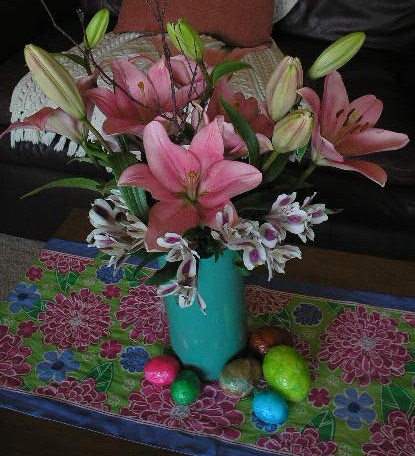
Do you remember these?
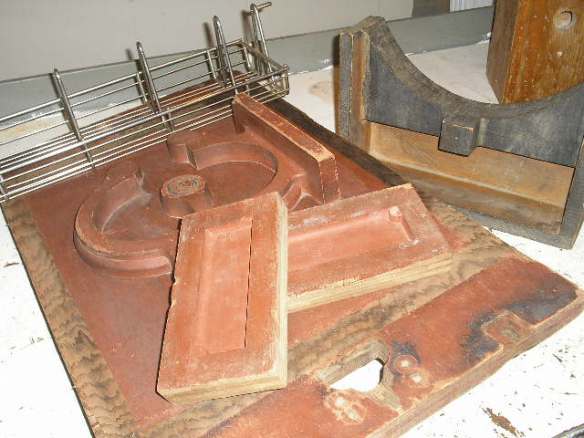
On one of my “Junk Trips” last summer . . .

ARTZZLE.COM

I found all these wonderful wooden pieces,
and mentioned them HERE 

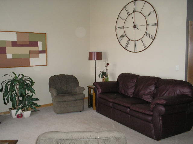
And most of you . . . even Newer Readers, will probably recognize . . .
the wall artwork in this picture

ARTZZLE.COM

Followers with me from the get-go . . .
may remember the same painting . . .

ARTZZLE.COM

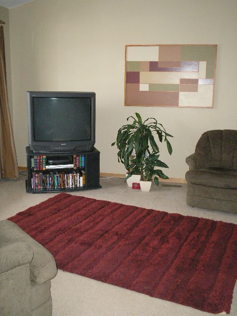
hung in a different direction.
The art piece was done years ago. I needed something BIG and colorful.
And everyone knows how manically changeable I am,
so I wanted options there too.

ARTZZLE.COM

One afternoon, as I woke from a nap,
sleepy eyes caught a wonderful pattern.
reflected from a multi-paned window,
great lines and shapes in light and shadows.
On that day, and at the same time for the next two days,
I worked to capture the design on my drawing pad.

After scaling it up proportionately,
Hubs cut a piece of plywood in that size.
I graphed out my design . . . and began to paint,
using colors from throughout my home.
When the paint was completely dry,
I came in with a narrow brush and some metallic copper paint (by Behr),
and carefully trimmed each section with a thin copper border line.
Hubs added a simple, modern look frame and it was finished.

WELL . . . it met my initial wants and needs,
BIG, BRIGHT and CHANGEABLE.
I could hang it several ways,
and I painted new colors whenever I wanted.

BUT, there was always something not quite right. Know what I mean?
Oldest son and youngest daughter
are always my best “art” sounding boards.
We all agreed that it was lacking . . . it was boring, it was too FLAT.

ARTZZLE.COM

Well . . . FINALLY, the other day . . . I had this idea.
In Hubs’ shop, I rounded up some of my barn sale junk
and raw walnut pieces,
and an odd collection of small, miscellaneous items.
I just played with them, placing them randomly
on the painting until satisfied.
I then used wood glue to adhere the items to the painting’s surface.

ARTZZLE.COM

After waiting for two days, to assure that
even the heaviest pieces were attached,
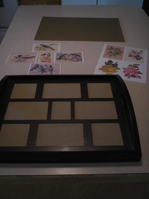
I had more fun, playing with some fun-tac and small accent items.

ARTZZLE.COM

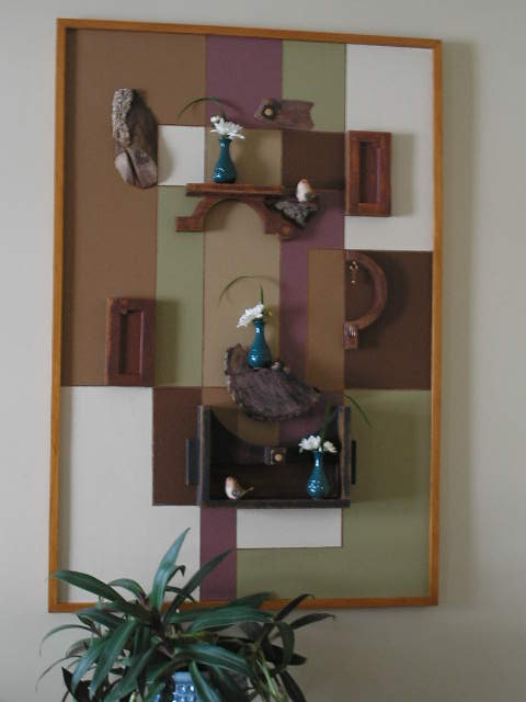
The pictures show the succession of arrangements.

ARTZZLE.COM

My final look . . . ( or should I say, present look ) is below.

ARTZZLE.COM

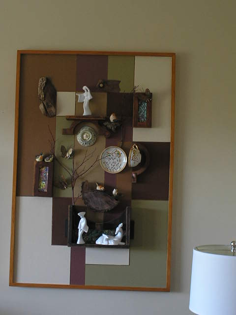
I hung a cup from the hooked wooden piece,
and tacked it’s saucer flat to the surface.
I am crazy for wooden branches and included two.
And finally, I printed an excerpt from a Van Gogh painting I favor,
then cut pieces of it to use as inner liners on three of the wooden items.
The larger figurines and dishes used, are of a Japanese theme.
Birds, butterflies and a Victorian styled medallion were also included.

So the painting is no longer boring and flat.
I’m happy . . . for now, at least, ha ha.
It would be fun to know what you think of my collage.

As always, thanks for stopping by.
And don’t stress too much, just start that project.

Later – Cheryl

***
This original article “Do You Remember These” appeared first on Artzzle.com. No included content or photography can be used elsewhere without specific permission and accreditation.

Copyright © 2013-2014 Artzzle All Rights Reserved

Eclectic LOVE

Eclectic LOVE


Using a similar couch and flooring,
and working with their personal color palette,
here is an inspiration board I did for prospective clients.
Working with the client, I design three boards;
a preliminary after our first meeting or discussion,
a second for further ideas and development,
and a final board as close to their wishes as possible.

With a program like Polyvore,
I’m able to search for items by style, color, price or piece.

I usually pull items within a specific budget range.
But sometimes on the first boards,
it’s fun to just grab anything interesting,
to show examples of texture, shape and help get ideas flowing.

The title line (seen above, between the board and the products list)
is the link to my Polyvore site.
Check it out for more FUN!

And I’m still floating on air, having been
FEATURED on THE GRAPHICS FAIRY,
so take a look!

Have a great Mother’s Day.
Whether with you in life, or alive in your memories,
it’s a wonderful time for reflection!
Thanks for stopping by.  I hope you enjoyed your visit.

Later – Cheryl

My 1st . . . “I’ve Been Featured”

ARTZZLE.COM

I’m so excited . . . I’ve been featured on another blog.

A VERY BIG THANK YOU

To Karen over at THE GRAPHICS FAIRY

for featuring my MOTHER’S DAY TRAY

Short and Sweet this time, readers . . . but I just had to tell ya’! 🙂

Take a Seat

Take a Seat

Hi All.

Click the link above and find me on my newest discovery,

 Polyvore.

More to follow soon.

Later – Cheryl

GREAT ways WITH GRAYS

GREAT ways WITH GRAYS


Hi All.  How’s your Friday going?

Well, finally Spring has arrived . . . or at least is very close by.
While we’re all glad for better weather,
many are anxious for other changes as well.
At our house, we want to paint the main living areas.
Wait, let me rephrase that.
We both want new paint, but Hubs wants me to be the only one painting.

While we usually lean towards browns and beige,
since our BATHROOM CABINET PROJECT,
we’re going for grays.

So I’m heavy into research for gray combinations.

50scolor

True, gray tones are trendy right now.
But it’s not at all new in interior design.

In the 1950’s, gray was very popular combined with a dusty pink,
or with a low intensity turquoise.

Think “Poodle Skirts“.

ARTZZLE.COM

BETTER HOMES and GARDENS online,

BHGartzzle.com

has a wonderful article on how great gray is to use,
with nearly any accent color.

Here at our place we’ve decided on two tones of gray,
a light neutral and a mid-tone, darker shade.
As for accent colors, well . . . that’s gonna take a while yet 🙂

Have a great weekend and as always . . .
don’t stress too much, just start it.

There are lots of fun links today, so check them out!

Later – Cheryl

***
This original article “GREAT ways WITH GRAYS” appeared first on Artzzle.com. No included content or photography can be used elsewhere without specific permission and accreditation to sources.

Copyright © 2013-2014 Artzzle All Rights Reserved

Marvelous No-Mess Project

What are we crafters and DIYer’s always on the hunt for?
Besides FREE stuff, I mean.
Something we just cannot find enough of.
C’mon, you know this one.

GRAPHICS of course! And yes, free graphics, right? No royalty or fees.

Well, I have em’ for you . . . tons of them even!
Just visit THE GRAPHICS FAIRY
and enter a wonderful world of vintage graphics.
Everything from fonts to flowers, birds to children, all kinds of pretties.

ARTZZLE.COM
Last summer, I found this brand new wooden tray at a garage sale for $3.00. It had a dark finish, which I liked, and a glass insert on the tray. Ooh, but it gets better, because it also has a matted sheet . . . you know, one of those multiple photo cutout frame dealies. I wanted a quick, clean project for today, and I still hadn’t done anything with my tray. I was also trying to develop an idea for Mother’s Day. My mom isn’t here any longer but I was thinking about all the things she loved.

ARTZZLE.COM
Long story short. I headed over to Karen’s place at The Graphics Fairy and searched for flowers and birds and nature offerings. It was difficult to decide on favorites because there were so many beautiful options, but I chose birds and flowers . . . in honor of Mom. All I did was copy them onto my desktop. Then I printed them, sizing each down close to the openings in my frame mat. Some couldn’t fit just right, so I used a coordinating sheet of craft paper to back the frame and fill in where needed.

ARTZZLE.COM

A couple years ago, Hubs and I took an old chair apart and made a little bench. Our tray sets atop that and we use it as an end table most of the time. It’s double duty and we can always remove the tray and have extra seating!

TIP: On a plain tray with no photo mat or glass, you can decoupage some beautiful graphics on, let it dry completely (let it sit for a day or two) and put a piece of clear vinyl contact paper over top.

Hope you enjoyed today’s idea.  Your comments are always welcomed! (hey, I love em 🙂 )

Later – Cheryl

***
This original article “Marvelous No-Mess Project” appeared first on Artzzle.com. No included content or photography can be used elsewhere without specific permission and accreditation.

Copyright © 2013-2014 Artzzle All Rights Reserved

More Color . . . Less Words

ARTZZLE.COM

It was a perfect Sunday for Easter.
Bright, budding and . . . beautiful.
Such a glorious day leaves one speechless.
So today, I’ll leave the words to you,
and simply share some color

ARTZZLE.COM

Two simple bunches of flowers

ARTZZLE.COM

Alstroemeria

ARTZZLE.COM

Lilies

ARTZZLE.COM ARTZZLE.COM

TIPS:
1. For longer lasting flowers; when choosing Alstroemeria, find bunches with buds just starting to open. The flowers will appear narrow . . . not fat and fully open; when choosing Lilies, choose stems that have at least one or two blooms partially or nearly fully opened, and buds beginning to burst. Small, very tight, green buds often will never open.
2. Trim stems to your desired length, always cutting at a slight angle.
3. Remove unecessary leaves that will be below the water line and/or not showing.
4. Change water every other day or so when in a standing vase (clipping stems tips again, slightly). For more permanent arrangements, just be sure that water is added when needed to keep it at a consistent level.
5. Always use COLD water.

I hope this helps start your week right.
Until next time, try not to stress too much, just start something.
Glad you stopped by and remember, comments are ALWAYS appreciated

Later – Cheryl

***
This original article “More Color … Less Words” appeared first on Artzzle.com. No included content or photography can be used elsewhere without specific permission and accreditation.

Copyright © 2013-2014 Artzzle All Rights Reserved