Wow, That New Color Is Just . . .

. . .  NOT WORKING !

There’s always plenty of color around my house.  That is no surprise to anyone.  And even my frequent wall color changes are familiar to most.  Long time readers will also recall that probably close to 80% of walls around here lean to neutrals with warm tones.

OLYMPUS DIGITAL CAMERA

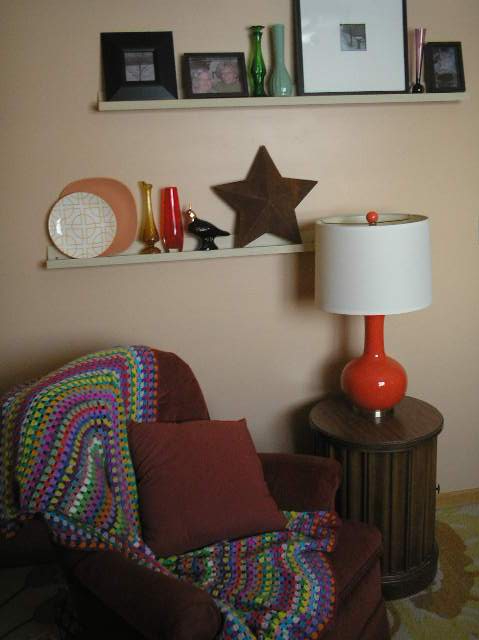
The master bedroom has a burnt orange accent wall with sides in a dulled gold color.  The gold is very light but below, you get a little better idea, with it against the other walls/ceiling.

OLYMPUS DIGITAL CAMERA

My studio/workroom is also nice and warm.

The most recent look on walls in our one and only bathroom, went from very light beige to blue,  a rather warm aqua but still blue, which was a big difference.

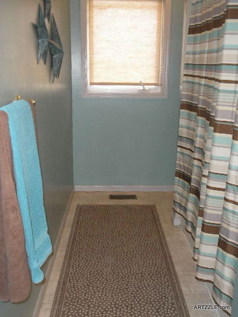
Again, wall color in the photo is off.  The top aqua stripe in the shower curtain is closer.

OLYMPUS DIGITAL CAMERA

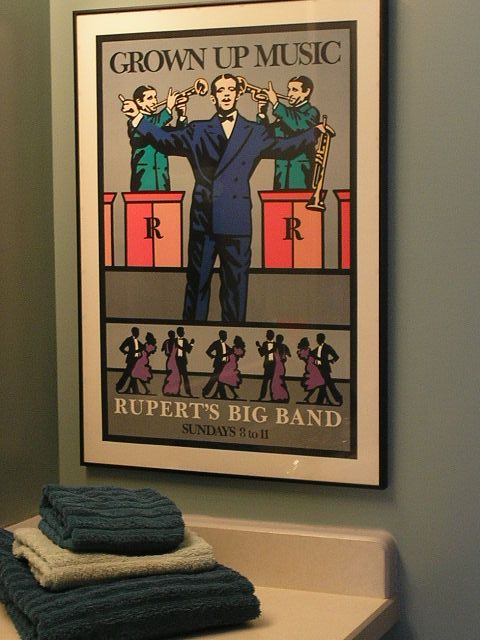
Above is a corner of the vanity in that room.  Wanted to share the funky poster, but again, the photo does not represent the true wall color, which is much brighter.

Last Fall while recovering from surgeries, I was becoming very restless . . . and so bored!  (started to say I was “dying” of boredom but decided it wasn’t a good word choice here 😀 With little to do besides stare at the walls, it seemed my accent walls in particular, had also become boring and no longer much of an accent.  Time for a new look.

So I decided to change the three accent walls in our open living area.

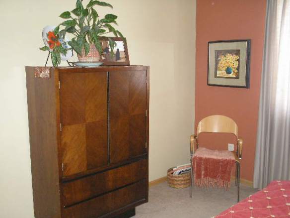
This offered another opportunity for me to step out of my usual color family.  Hubs likes blues. Our second bedroom is in a gray-blue shade, and he is really happy with the bathroom.

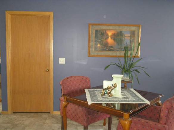
So I went from this . . .

. . . to this.

OLYMPUS DIGITAL CAMERA

and after a switch out of chairs, to this.

OLYMPUS DIGITAL CAMERA

When we were discussing and testing paint chips, it came down to a deep gold or a blue of some kind.  All the gold samples we saw seemed just too yellow.  Hubs called them “baby poop” !  Switching to the blues, I succeeded in finding a shade pulled right out of the painting.  It’s almost exact.  You can read all about it   over here.

Now it’s about five months in, and when I say “in” that is literal.  We’ve had record breaking snowstorms and cold weather this season, so we’ve stayed in … a lot!  Lots of looking at that one big wall and a smaller one in the kitchen.  I didn’t even get to the third wall that’s always included with the accent color.

I had to work at adapting, and kept telling myself we just needed to sprinkle a similar color around with accessories in the other rooms of the living area.  Before we changed chairs, I reupholstered the seats on the mismatched sets

From this . . .

.OLYMPUS DIGITAL CAMERA

. . . to this.

OLYMPUS DIGITAL CAMERA

In the kitchen side of the open area, I brought in some blue dish displays.

OLYMPUS DIGITAL CAMERA

But they were a bit too light for our new walls.  So I darkened things up . . .

OLYMPUS DIGITAL CAMERA

That felt much better, so I continued with the dark blues on the cabinet top displays out there too!


Well now, we are loving the new displays, and have received lots of wonderful complements on them.  So it has helped me warm up to the new walls.  Hubs said he liked the color . . . at first, and remember he’s fond of blues.

He came in from the workshop today,  looked at me and said “I don’t like that color.”  I couldn’t believe it.  After living with it for a while, he says it’s too dark and cold, and wants something brighter and/or warmer.  That means more work, but it’s okay with him, because I do all the painting 😀  He DOES hold the ladder and wipe up drips though!

So friends and followers, I guess it’s a case of . . . here we go again.  No matter how much design knowledge you may have, or just plain good luck that’s been yours choosing wall colors . . . sometimes you just have to try one and live with it a while, to see how well it works for you!

We’ll all just have to wait and see on this room.  No worry, you’ll know what comes next!

–  Later  –

Cheryl


Pretty Plates Make Pretty Easy Decor

It’s not the best of titles, I admit, but wanted to get this article down as it came to mind.  In other words, I’m hoping to think of a better opener by the time I finish this post 😀

Anyone who knows and/or follows me, is very aware that I collect MANY things.  And when collecting, I never part with much moula.  Thrifting is the way I roll, and beautiful plates of all patterns, colors and sizes, are so easy to find!

This is a wall rack for multiple plates, that I bought for $2.00 at a local Good Will.

OLYMPUS DIGITAL CAMERA

Now, I am also known to push the envelope occasionally . . .

OLYMPUS DIGITAL CAMERA

so naturally, just one plate per shelf was far too boring.

OLYMPUS DIGITAL CAMERA

While not too bad a look, a bit too casual for what I was thinking of.

OLYMPUS DIGITAL CAMERA

So I added a second smaller plate in similar colors.

Hhmm.  Still needed something. Remembered I had these little beauties . . .

OLYMPUS DIGITAL CAMERA

and added them for a little bling.

OLYMPUS DIGITAL CAMERA

What do ya think?  Yes?  No?

Well . . . maybe just one more thing.

OLYMPUS DIGITAL CAMERA

Ah Hah.  And there we have it.

I’ll leave you with a few reminder tips

  1.   Make use of corner spaces AND floor areas as well as your walls
  2.   Use what you’ve got, but experiment, mix it up
  3.   Make sure the pieces in your display play nicely together
  4.   Multiple textures add interest … and a plant or two can help as well
  5.   When shopping, buy what you like.  It will all fall together at some point
    1.  All of the sets of plates here, were thrifted; none were purchased together, but bought separately … because I just liked them


OLYMPUS DIGITAL CAMERA

Thanks for hangin’ in there with me, even though posts have been few and far between of late.  Health issues have popped up, and we’re not quite done yet.  As shorter posts are easier, I’ll try to visit you in that manner for a while.

In the meantime, stay positive, keep exploring and experimenting with your home!

Later – Cheryl            P.S.  I just couldn’t come up with a catchier title 😀


Choosing Accessories

One of my favorite places to play, is over at POLYVORE.  Those ideas I have in my head, can be created right on the screen.  I can get an idea of what it might look like.
You’re not buying anything, you’re just scrolling through literally thousands of cool items, then selecting them and making your own little design board, right on your computer, like this one below.
People often ask me “what to use or how to pull a room together”.  So tonight, I had a little fun over at POLYVORE and made a set to help demonstrate what might be done.  I used the new colors in my master bedroom and went from there.
CLICK the UNDERLINED LINK beneath this set to read my advice and hints.  And check out the entire site while you’re there.  You’ll have fun.
Choosing Accessories


No Time or $$ Wasted in Fall

October 11th and Fall is rising!  Even with two holidays in this season, decorating doesn’t take much time to be terrific, or at least it doesn’t have to.  Are you wondering what else can be done besides the old black & orange for Halloween?  Keep in mind that all of the autumn colors can carry your decor through to Thanksgiving.

Colors in the orange and brown ranges are some of my favorites, meaning I have plenty of accent pieces for displays right now.  True, you won’t have the identical items I’ve used, but as I always say “Use what you have”.

OLYMPUS DIGITAL CAMERA

A simple group above.

  1.  Small bowl and two bright plates
  2.  Cream and Sugar set
  3.  A stem of artificial florals

Everyone has plates and bowls, and if you don’t have a C & S set, try two mugs, or a mug and a pretty glass.  No glitzy fake flower stems . . . SO WHAT.  Find some pine cones, funky branches or pretty leaves.  Those are FREE, and no storage worries either, just throw em’ away when you’re done!

OLYMPUS DIGITAL CAMERA

This little group holds display tips for you, so don’t worry about not having everything in it.

  1.  Using an odd number of items in your display, is a helpful rule of thumb, but that isn’t to say it’s always a requirement.  Try starting with just three pieces and depending on your items and space, work from there.
  2.  Use varied heights and textures.  Here I have a lot of glass, so I chose different colors, textures and shapes to avoid a “ho hum” effect.
  3.  Try for one piece that will tie things together.  I placed a fun resin figurine ($1.00) in this little group.  It’s seasonal, cute and helps unite my colors.  I also like to have most pieces touching, in a display.  You’re not sending them to their separate corners … you want them to play together.


ARTZZLE.COM

Give yourself a break, and make things easy.

  1. Use pictures and artwork that represent the season’s colors.
  2. Cozy, textural throws and colorful toss pillows are easy additions.
  3. Plants give life to an area in any season (brighten them with a pretty bow).  Finally, a few favorite treasures on your side table and boom . . . you’re done.

Autumn is so easy to decorate for.  A quick walk on a bright and brisk day, can provide countless natural add-ins.  Small, affordable plants and bouquets are available in stores everywhere.  Bring em’ home and throw it in a vase, a bowl … heck a big tin can (but cover the can in a pretty wrapping paper 😀 )

Thrift stores have endless amounts of wonderful decor items (and collectibles that you can treasure and use again and again)!  Take an afternoon or a hour after work and have a blast, discovering oodles of treasures!

YES, it’s repeating myself, but I can’t stress enough . . . USE WHAT YOU HAVE!  Shop your home … shop your Mom’s home, or Aunt Lil’s.  They’ll let you borrow and probably give things to you for your place 🙂 !  Memory pieces are the most meaningful decorations you’ll have.

Plants, plates, mugs; scarves, throw rugs, mittens, fabric, dish towels; books – Books – and MORE BOOKS.

  1. Use what you have or have access to
  2. Buy what you love AND can afford at the moment
  3.  Don’t stress out, just DO something, and have fun

You’re always welcome to stop over at my facebook page and see what’s happening there.  Lots of crafty creations going on right now.

Later – Cheryl


Quick, EZ Summer Color

ARTZZLE

OLYMPUS DIGITAL CAMERA

“Avid gardeners” describes three special ladies in my life. Every summer as I was growing up, so were the gardens of my Mom and Aunt Lil. When we kids were all little, the patches included as many vegetables as flowers. Sitting on the porch “helping” clean snap peas, we probably ate as many as were put into the basket! And many a fresh tomato was snatched off the vine and eaten like an apple, for a summer afternoon treat!

Over time, as the seats at the dinner table emptied, the gardens transitioned to nearly all flowers with just an occasional tomato plant or two. Though “in-laws”, my mom and aunt were as close as real sisters. Each year they would have this “unspoken” friendly competition over who had the best garden that summer. I remember gladiolas taller than my mother, and fat, bright faced zinnias in Aunt Lil’s credenza vase.

View original post 862 more words

Cards for Mother’s Day

ARTZZLE

Sunday is Mother’s Day. As a floral designer, I know it is a big, busy day for that industry and reason for card companies to celebrate! As a Mother and Grandmother, I love the anticipated arrival of either cards, flowers, or better yet both! What fun.

A card is always appreciated, but is even more special with a personal touch. I enjoy making and sending hand-crafted greeting cards, and am sharing these latest projects with you. This is a Make-Do project for me; no need for outside shopping or spending because over time, I’ve amassed an abundant supply of papers, scrap, notions and envelopes.

Cards can be as basic as paper and envelope, with simple decoration and a hand-written message (and a little help from parents for pre-schoolers!). A standard size and weight piece of paper folded in half then in half again, gives you the typical card form and…

View original post 342 more words

There’s A Worm At The Bottom Of The Garden

Beautiful floral shots from a beautiful (and hard working) gal over in Scotland. Even on break, she’s diligent about her musical career BUT glad to see she takes a little time off too 😀

Charlotte Hoather

Ahead of some exciting projects that I have coming up over the next couple of months I took the opportunity this week to visit my teacher, Judith Howarth, for an energising lesson to help me in my preparations.

In-The-Garden-Header Me With Judith Howarth

We worked on a variety of music, which I will be excited to tell you all about very soon. Whilst I was there we chatted about different operatic roles and it was lovely of her to show me some of the pictures that she has in her home from her fabulous career; so many different roles that she has performed from all around the World. Her mum created photo albums with pictures and newspaper clippings displaying her musical journey, It was so inspiring, so I thought I would take a picture of the two of us and start creating a post degree scrapbook for myself with my Mum…

View original post 224 more words

From Gloomy to Good

For a host of reasons, I’m always glad to see
the third month of the year disappear.
Though someone in my life seems to be
on a mission to start a new tradition
to brighten my March with cheer.

It began last year with this little lovely.

And late afternoon today … another knock at my door … brought this beauty.

Artzzle March 2016 post

Though March will be my least favorite month … forever,
my daughter Bri is determined to make it better.

Thanks, Breezer. Luv Ya lots! … Love, Ma

Artzzle March 2016 post

Later, Readers.