HAPPY AND SAFE 4TH OF JULY TO EVERYONE.
What wonders we would have known had he lived!

Thank you Veterans!!!
Greater love has no one than this, than to lay down one’s life for his friends. (John 15:13 NKJV)

HAPPY AND SAFE 4TH OF JULY TO EVERYONE.
What wonders we would have known had he lived!
Thank you Veterans!!!
Greater love has no one than this, than to lay down one’s life for his friends. (John 15:13 NKJV)

Are you asking “Why Choose Black For Summer”? I chose black because my daydream was about my granddaughters’ upcoming events, and the “on-the-road” aspects. First of all, the “Black goes with most anything” idea and the “Little Black Dress” rule (which also includes slacks) always travel well. Black doesn’t show spots and stains as boldly as lighter colors do. An easy wipe away will usually do the trick, without laundering, which no one wants to do on a short leisure trip (especially teenagers!).
Here comes the color . . . and the Fun!

I would love to get your ideas on outfit combinations . . . and all else from today. Leave a comment or you can find my email on my profile page.
This post was fun for me . . . hope you like it too!
Remember . . . if you stress too much . . . that trip won’t be as much fun!
Later – Cheryl
PS: APOLOGIES for the erratic spacing in this post. Working between VISUAL, TEXT and three individual Polyvore articles, seems to have scewed the platforms.
*** This original article “EZ Pack Summer Trip Wardrobe!” appeared first on Artzzle.com. No included content or photography can be used elsewhere without specific permission and accreditation from contributors. Outside sources are marked when available.
Copyright © 2013-2014 Artzzle All Rights Reserved
IT’S POSSIBLE THE “G” COLOR IS IN MIND LATELY BECAUSE . . . I’m such a magazine maven, and it’s everywhere one looks, in all my magazines and books. I’ve been putting together a piece from the July/August TRADITIONAL HOME, with some beautiful stuff for you.
THEN TODAY, WOULD’NT YOU KNOW … my email contained a Joss And Main flyer, and there it was! A Grayscale Lookbook! Just for me … well … at least in MY email 🙂

View their IN GRAYSCALE LOOKBOOK .
IT HAD TO BE DESTINY . . . because things didn’t stop there.
LOOMED LARGE . . . another LookBook, had so many ideas in grays AND coordinating accents. Of course the first picture (above) jumped right out.
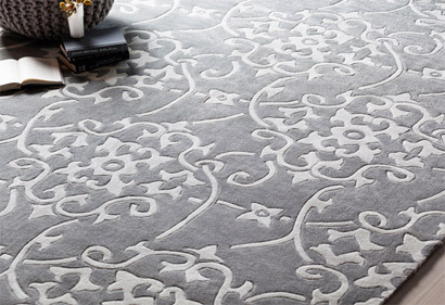
ONE OF MY LONDON FOLLOWERS . . . Jess Weber, recently purchased a new “flat” and asked me about gray (grey) carpets. Hey Jess, look at all these great examples! Catch her hilarious blog at JESS WEBER.
AS FAR AS NEUTRALS GO . . . most people consider either beige or grays as the main choices, other than white, of course. Many relate beige with warm and gray with cold. I’m here to prove that . . . “It Ain’t Necessarily So”. And as for whites, go to any paint store or website and look at their “Whites”. You’ll find a wide range of choices, BOTH warm and cold!
EVERY COLOR IN THE SPECTRUM . . . has warm AND cool tones, even those you consider as neutrals. Also, the “feel” of the color can depend greatly on the accent and accessory colors you use with it, and those in adjoining spaces.
DONNA FRASCA IS A COLOR EXPERT . . . literally. Check out what she has to say about neutrals. Here’s Another interesting perspective on her blog.
YES, IT’S STILL CRAZY BUSY . . . around our place. I have at least four other ideas I’m developing for articles. After the great results with our bathroom cabinets redo, Hubs and I have begun those in our kitchen.
YOU MAY FIND IT DIFFICULT . . . to believe but, we didn’t choose the same gray finish for our kitchen. Big shock there, huh? And we want our island to be a different color than the rest of the cabinets out there. There was an entire quart left over of the gray from the bathroom. Now, I had (what I thought to be) a clever, and cost effective idea. I took it to my favorite paint mixer, Sue, at our local Marv’s TRUE VALUE.
SUE REALLY KNOWS HER STUFF AND WE’VE WORKED TOGETHER BEFORE. (That’s probably why she groans when I walk in!) I explained my idea was to tint the gray to a bit different shade. After agreeing to sign in blood, saying I wouldn’t have repercussions if things didn’t turn out as I had hoped . . . we worked (for at least an hour in between other customers) until I hit on something I liked.
Below is the color our island will be. Only the drawers and doors are finished at this point.
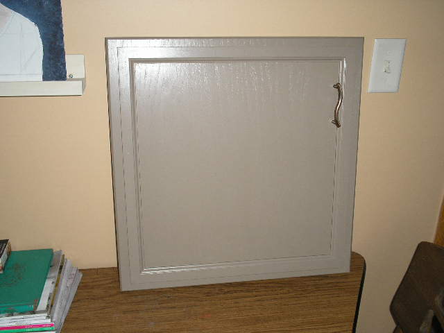
I’M NOT SURE WHAT YOU WOULD CALL THIS COLOR . . . gray, brown, greige? With the light and wall color in the room where this picture was taken, it looks almost lavender, but really isn’t. Whatever, we love it – yes, Hubs does too! So a money saving, good idea right? Well, YES and NO.
TIPS:
1. Yes, it is possible to retint leftover paints. Just be sure you’re working with someone who knows what they’re doing … like SUE.
2. BEFORE you have extra paint recolored … REMEMBER to keep a bit of the original color, for retouch and patching on your original project. Ooops … Cheryl forgot that part 😦
3. Always keep in mind that all colors NO MATTER WARM or COOL, are affected by their light and surroundings. You need to be aware of that when choosing your paints.
NOW, I’LL CLOSE WITH ONE MORE FANTASTIC GRAY . . .

the lovely, Gracie Mae. And aren’t those pink, beige and gold accents so becoming!
IT’S THE STANDARD LAST LINE . . . don’t stress, just start!
Hope this was a fun one. Check out all the links . . . they’re good ones!
Later – Cheryl
*** This original article “A LOOKBOOK … in Grayscale!” appeared first on Artzzle.com. No included content or photography can be used elsewhere without specific permission and accreditation from contributors. Outside sources are marked when available.
Copyright © 2013-2014 Artzzle All Rights Reserved
JUST A QUICK POST TODAY . . .
Perhaps to change some minds about GRAY!

*******
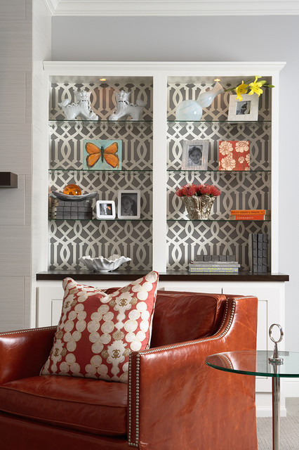
WHY DOESN’T THIS GRAY BELOW FEEL COLD? The picture below is from one of my HOUZZ IDEABOOKS. It’s a favorite for many reasons, but note the gray walls and patterned wallpaper. It’s nice and warm because of the furniture pieces.
The shelves pick up the warm oranges, browns and gold with the accessories and the gray wallpaper backing works, because of the added neutral pattern. This paper use also adds texture and a fun interest to the room’s decor.
*******
HERE’S ANOTHER PAPER BACKED SHELF EXAMPLE.. Erin over at How to NEST FOR LESS used it in her pantry.

*******
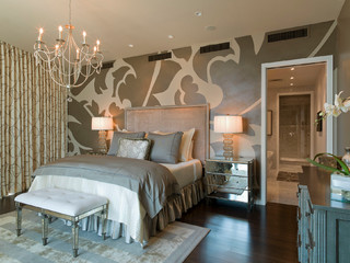
LOOK AT THIS WILD GRAY! It certainly heats up this bedroom! (get it, hot … bedroom … maybe I’ll just stick to decorating!) 😦 Anyhoo … another of my HOUZZ pictures.
*******
AS PROMISED, CLOSING NOW TO KEEP THIS SHORT. Have fun with all the links . . . and some of you gray grievers, let me know if things are warming up for ya!
YOU KNOW THE LAST LINE. Don’t stress out, just start something.
Later – Cheryl
*** This original article “AFRAID OF GRAYS … Part 2!” appeared first on Artzzle.com. No included content or photography can be used elsewhere without specific permission and accreditation from contributors. Outside sources are marked when available.
Copyright © 2013-2014 Artzzle All Rights Reserved

CRAZY … CRAZY… CRAZY ! That’s our place lately. So I multi-tasked today and combined Polyvore work with this post. Above, the task was to create a bedroom for myself, decorated personally and including a canopy bed. Grays have been batting my brain cells around, so I used a gray-blue color range and a few specific, spunky pieces. Go ahead and link up for all the details. Canopy Contest by artzzle-com
APOLOGIES FOR . . . so few posts of late, but honest . . . I really have been working on them. What’s happening though, is so many great ideas are flying around that, I have trouble finishing any because I need to write down another one before I forget it!
COLORS AND PAINTING . . . are topics that have been right up front in my thoughts most often. Both because Hubs and I are working on main projects in our own home, and I’ve been researching for an upcoming series of posts.
READERS, YOU PROBABLY AREN’T SURPRISED . . . when I say that our preferences always lean WARM. Lots of beige, browns, coppers, and like that! Well you may be shocked to hear that we’re (mostly I’m) craving a change. We just bought new furniture pieces . . . two recliners and a cute little love seat. Don’t get too excited yet . . . they’re brown. A beautiful soft, chocolate tone.
NOW, THAT SAID . . . we are changing accents and a few wall colors. They’re running to GREEN (warm of course), and I’m bringing back a favorite, AQUA. Not the bright, neon shades. I’m muting them, with warm gray tones. And speaking of gray, I’m pulling in several versions of it, and a couple of wonderful gray-blues.
ARE YOU MAKING A SOUR FACE YET . . . at all the gray? The nose turned up . . . the lips scrunched and grimacing? “Grays . . . seriously?” Well . . . YES, and let’s do get serious. All you TREND FOLLOWERS will be on top of things with grays. They are VERY POPULAR presently in decor. Not only have color combos with grays as primaries, been favorite decor schemes for decades, they continue to be as useful as the beige family, for neutrals OR accents, as well.
TAKE A QUICK LOOK . . . at the Polyvore set below. Some of these ideas are on the mood board Hubs and I are working on.

IN A SERIES OF UPCOMING POSTS . . . I’ll feature more info, ideas and examples of just why grays are so wonderful to work with.
LEAVE A COMMENT AND TELL ME . . . how you feel about GRAYS. Then we’ll see what you think at the end of the series. Who knows 🙂
MEANTIME . . . you know the line. Don’t stress too much, just start something.
Later – Cheryl
*** This original article “ARE YOU AFRAID . . . of Grays!” appeared first on Artzzle.com. No included content or photography can be used elsewhere without specific permission and accreditation. Outside sources are marked when available.
Copyright © 2013-2014 Artzzle All Rights Reserved

DON’T STRESS TOO MUCH . . . JUST START SOMETHING!
How many times have you heard me say that !?
There’s been a lot of extra stress lurking around here lately! Vehicles down, allergies up (WAY up) and a couple short-check weeks, just for a few examples. Oh, and that nasty neighbor (who of course, lives right next to us) in our otherwise amicable neighborhood! Doesn’t it seem like every area has one stinker in the bunch. Ack!
The blog and accompanying social sites have kept me very up and down i.e. great then lousy, and quite literally UP at night! That isn’t new of course, but continuously stressful.
Well, I’m thinkin’ it’s about time I followed my own advice! I’m tired of stressing out. Just tired period. So I sat myself down, took a bit of “me” time with the little notebook . . . and started a list.

OK, I hear some of you groaning … “Cheryl, you’re always making lists”! But hey, most times IT HELPS ME! I’ll thank you to cut me a little slack this time.
First, I affirmed that these would be concise notes. When writing anything, I always have to remind myself to edit, edit, edit.
Beginning, I jotted down three presently good specifics. Thought it would help to start on a positive note.

Okay, those are self-explanatory. Lets get to the crappola. Next, I listed 3 big stresses.
Yes, THE BLOG is still very troublesome.

Traffic and interest are very inconsistent, which I almost dread saying for fear I may get even more of those “Pitch emails or supposed new followers who say “I/We can make your blog wonderful . . . for just a few hundred dollars or so”.
I KNOW
I need assistance, but am very picky about where to find it, and also very self-critical that I can’t do everything myself. It still isn’t quite the look I’m going for. I’m not particularly thrilled with some of my posts. And although I’m venturing to more outlet exposure, most of the Social Media Tools are frightening to me!
I AM VERY REALISTIC
in knowing that odds are slim of making any measurable amount of monies from the blog. But I was hoping for a little mad money or occasionally enough for a minimum household payment or two.
That leads us to the other money issues . . . which are MORE than just a bit scary, especially when full retirement is looming. Once we decide what things we can create and sell when Hubs retires, we should be okay but It will be a penny-pinching ride all the way,
Last, the personal issue. Don’t worry, Hubs and I are fine; just celebrated 29 years of marriage and nearly 31 years together . . . and NO . . .
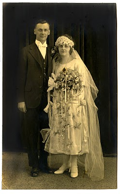
. . . this IS NOT our wedding picture!
Source: THE GRAPHICS FAIRY
The stress is another relationship that has changed drastically for us in the past few years and seems headed for a complete breakdown. Something once loving, caring and sharing, has become discounted with limited contact, little sharing or inclusion and too often, rudeness with no consideration or caring shown us. We’re told we are at fault, yet NOT told the why or what of the matters.
So there you have it. I’m STRESSING . . . a lot, and I always tell you NOT TO STRESS.
WHAT DO YOU DO
in stressful situations? How do you approach the problems? There aren’t any magic solve-all formulas for any of us. Just curious to know what helps others.
My list did help. The physical writing then reading, helped me – shall we say- get a grip on things.
For all of us, it’s a very personal journey. We are the prime players in our lives, and so must be the primaries in how to handle the problems in those lives.
WOULD YOU AGREE
that there is no such condition as a stress-less life? That said we do have choices. Perhaps I should say we can give ourselves choices.
I chose to stay with the blog . . . and what do you know. A few nice “someones” came along with some helpful advice and encouragement.
And instead of brooding, Hubs and I have been scouring Pinterest and our own project notebooks and compiling a nice list (yah, yah . . . another list) of cost effective items that would be sale worthy in our direct area, and others that would have a broader, more urban appeal in the cities.
The more personal area is a toughie. No one can control someone else’s behaviors, especially if communications aren’t welcomed. But we can lean on others who do care, and try to toughen up when people get hurtful. We can let them know we continue to care about them and will be as supportive as possible.
BUT (and that’s a BIG ONE HERE) if/when people become abusive . . . and YES, verbal and/or emotional abuse count … I’ve learned to not allow it and remove myself from the situation IMMEDIATELY. Many wise people have shown me that over time.
Thanks so much for visiting. Hey, let’s talk more about this stress stuff. Leave a note.
As always, don’t stress too much . . . just start something! Geez, did I really just say that!
Later – Cheryl
*** This original article “IT’S ABOUT TIME. . . I Took My Own Advice!” appeared first on Artzzle.com. No included content or photography can be used elsewhere without specific permission and accreditation. Outside sources are marked when available.
Copyright © 2013-2014 Artzzle All Rights Reserved

*****
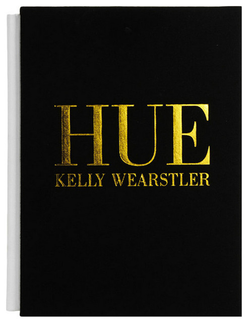
Hi All.
One of the
WILDEST
and
WIDELY KNOWN DESIGNERS
around today is
KELLY WEARSTLER.
She’s literally everywhere.
IN PRINT . . . here are just two of tons.
ARCHITECTURAL DIGEST featured her, saying “To hire Los Angeles designer Kelly Wearstler is to buy into her singularly bedazzling, high-chroma style.”
VOGUE MAGAZINE, writer Hamish Bowles discovers “Kelly Wearstler brings fearless graphic flair to everything from hotels to scarves—and now, to her own Hollywood manse.”
ONLINE
I couldn’t possibly begin to list every online avenue for Kelly. So I’d suggest a simple GOOGLE to choose which sources look most interesting to you. HOUZZ, of course, is on my fav’s web source list. It’s a stockpile (14,800+ images) of pictures of Wearstler’s designs Regular Readers know and follow me there.
In wallpaper
In upholstery and decor fabrics.
And with a wonderful line of accessories, both decor and fashion.
Be sure to look up her publications, including this one.
A basic summary on Kelly can be found on WIKIPEDIA
CHERYL SAYS: Ms. Wearstler is fearless in her pursuit of design, in any area she chooses to explore. And need I mention . . . successful in all of those pursuits.
As often mentioned on Artzzle, I like a few things about many, many designers and styles. I very much enjoy her bold use of black and white (DYNAMIC DUO), and I admire her decor AND fashion accessories pieces. While product line pricing is prohibitive to many shoppers’ budgets, you CAN find some of the smaller items affordable if you research online. And you “KNOCK OFF” DIYers, could have some fun with her wonderful works.
Thanks so much for visiting.
As always, don’t stress too much, just start something!
Later – Cheryl
*** This original article “DESIGN INSPIRATIONS FROM KELLY WEARSTLER” appeared first on Artzzle.com. No included content or photography can be used elsewhere without specific permission and accreditation. Copyright © 2013-2014 Artzzle All Rights Reserved
CLICK THE CHICKEN QUEUE !!! SO FUN 🙂
********
Hi All.
I get a daily dose of wonderful,
from the blog LEAF and TWIG, and
I just HAD TO SHARE today’s gem.
I’m thinking patience not luck,
produced this wonderful composition.
Thanks, Seedbud
Have a wonderful weekend, everyone . . . and remember,
try not to stress too much, just start something!
Later – Cheryl


*****
Today I’ve entered a contest on Polyvore.
If you haven’t yet visited,
Go and explore POLYVORE
Set up an account just for you,
So you can create your own sets too!
Fashion and Home
Art and More
YOU DON’T HAVE TO BUY
Just have fun and explore!
Talk to you again soon!
Later – Cheryl
Hi All.
Memorial Day Weekend is
the unofficial start of Summer.
It’s the official time
to remember our Veterans.
While we enjoy three days off, stress-free
they are in outposts around the world,
with no days off . . .
risking, even forfeiting their very lives
to keep us free.
So . . . YES, please . . .
remember them on Memorial Day,
but also remember that our soldiers, our vets,
are there for us everyday . . .
as we should be for them.
Later – Cheryl
***
This original article “Please Remember Them” appeared first on Artzzle.com. No included content or photography can be used elsewhere without specific permission and accreditation.
Copyright © 2013-2014 Artzzle All Rights Reserved