 Yay! Artzzle is up and running again and I’m glad to be back.
We’re happy, healthy and heavy into change. You regulars know that re-doing woodwork and cabinetry is an on-going process around here.
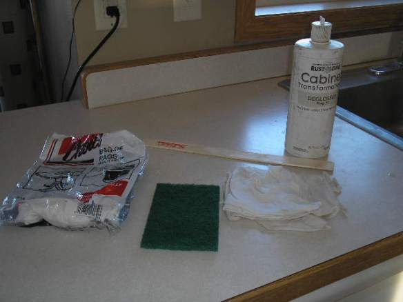
We started with our bathroom at the end of 2013 which you can see HERE. Find the step by step process using Rustoleum Cabinet Transformation, HERE. We were VERY satisfied with the ease of the project and the durability with use over time.
So, when we headed to the kitchen, we went with that same procedure.

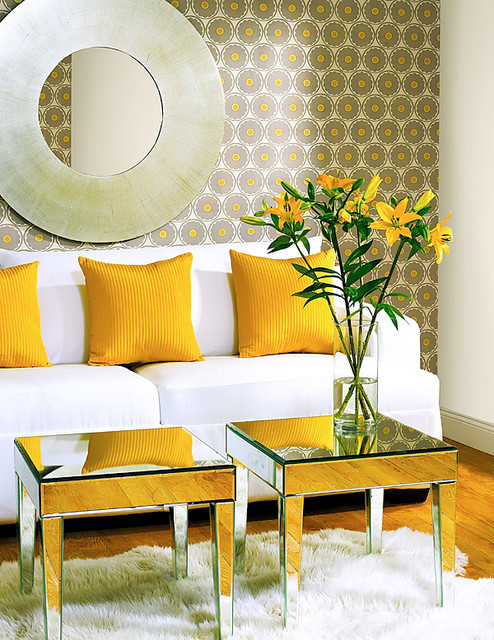
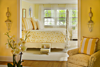
A two color, light/dark combination scheme was our goal in here. There are enough possibilities to make this a rather time consuming project. We have a separate island and then the normal upper/lower areas. Which would be darker, where would the lighter color work best? HOUZZ is one of the best sources for photo ideas, so I scoured it for hours, saving examples to show Hubs. See some of my choices HERE.
To begin, we had to actually decide on what the two colors would be, and this took us a good two months.
The votes were leaning towards grays, or beige with browns, with all of the outer cabinets light (tops and bottoms) and only the island a darker shade. Bold color doesn’t bother us, but our kitchen is right in the center of all the open living areas, so we wanted that space a bit neutral. You know how changeable I am with wall colors. That said, I didn’t want to have to repaint EVERYTHING, each time I needed wanted to redo an accent wall or two.
In grays, we chose three Glidden colors: Hope Chest BHG816 / Old Driftwood GLD811 / Partridge Gray BHG808. These aren’t 2015 colors so I couldn’t find samples online but, if you go to your area TRUE VALUE site, you can look up the colors we finally chose which were Kayak and Cake Batter.
Then over at our local True Value – Marv’s TV – we found Kayak and Cake Batter. I had Kayak in the family room already, and we both felt it would work to bring it out to the island. We had the wonderful paint counter crew at Marvs, mix a color as close to the Kayak as possible, with the Rustoleum products.

The island results were FANTASTIC. So much so that we decided to use Kayak on ALL of the LOWER cabinets.
NOW . . . by this time I was really tired of painting . . . anything. So we rested a bit, actually a couple of weeks. Then we began working on the upper cabinets (at least they would be a different color!).
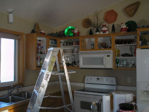
Again, same process. Hubs removes doors and added new trim to door fronts …

while I degreased and cleaned the cabinet frames and boxes,
and finally the redesigned doors.
Two coats were applied on the backs of each door and when dry, they were turned and two coats put on the fronts. While doors were drying, I applied the two coats to the hanging pieces. The front frames and outer boxes of the cabinets were painted …

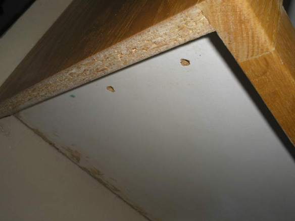
… as well as the undersides of each.
We also included the woodwork around the window above the kitchen sink.

Previously, there had been a decorative wood piece that connected the cabinets on each side of the sink. Well … it was supposed to be decorative, but we NEVER CARED for it. So in this process, Hubs removed it completely, and trimmed out the inside tops of the cabs. We both really prefer this look.

But ya know what always happens. You redo something and now it makes something else look bad. Such it is with the light above our sink. It was never a favorite piece either, but that will have to do for a while.
Here’s another shot of the newly finished upper cabinets. I’ve purposely cropped out the backsplash areas. That’s another recent project I’ll share with you next time.
NOTE: Just want to remind everyone that the light sources are so varied in our house, and change even more so during the day as the sun comes from different windows. The island and these cabinets are two distinctively different tints and shades in the same color family. Uppers are much lighter than the island, but in these pictures that isn’t as obvious.
TIP: The note above is a very good example of why you should always get the biggest paint samples you can find AND several different color ranges. Then you’ll be able to better see what they look like in your home and lighting.
I’m pooped so will close for now.
As always, don’t stress about that project too much, just get it started 🙂
A BIG THANK YOU for all the well wishes from you when I was on break.
And HEY … let me hear what you think of our new kitchen. Next big project will be to redo the lower cabinets in the darker color. We’re also removing a dishwasher and adding new storage spaces. Can’t wait to see you then!
Later – Cheryl


 Ahh … ain’t she sweet! Say “Goodnight” Gracie.
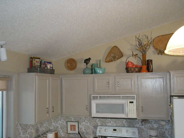


