***
This original article “The Blues” appeared first on Artzzle.com. No included content or photography can be used elsewhere without specific permission and accreditation.
Copyright © 2013-2014 Artzzle All Rights Reserved
***
This original article “The Blues” appeared first on Artzzle.com. No included content or photography can be used elsewhere without specific permission and accreditation.
Copyright © 2013-2014 Artzzle All Rights Reserved
Hi All.
DON’T WORRY . . .
today’s post IS NOT a rerun!
It’s just a fun new project with items you may remember
from past articles.
Do you remember these?
On one of my “Junk Trips” last summer . . .
I found all these wonderful wooden pieces,
and mentioned them HERE
And most of you . . . even Newer Readers, will probably recognize . . .
the wall artwork in this picture
Followers with me from the get-go . . .
may remember the same painting . . .
hung in a different direction.
The art piece was done years ago. I needed something BIG and colorful.
And everyone knows how manically changeable I am,
so I wanted options there too.
One afternoon, as I woke from a nap,
sleepy eyes caught a wonderful pattern.
reflected from a multi-paned window,
great lines and shapes in light and shadows.
On that day, and at the same time for the next two days,
I worked to capture the design on my drawing pad.
After scaling it up proportionately,
Hubs cut a piece of plywood in that size.
I graphed out my design . . . and began to paint,
using colors from throughout my home.
When the paint was completely dry,
I came in with a narrow brush and some metallic copper paint (by Behr),
and carefully trimmed each section with a thin copper border line.
Hubs added a simple, modern look frame and it was finished.
WELL . . . it met my initial wants and needs,
BIG, BRIGHT and CHANGEABLE.
I could hang it several ways,
and I painted new colors whenever I wanted.
BUT, there was always something not quite right. Know what I mean?
Oldest son and youngest daughter
are always my best “art” sounding boards.
We all agreed that it was lacking . . . it was boring, it was too FLAT.

Well . . . FINALLY, the other day . . . I had this idea.
In Hubs’ shop, I rounded up some of my barn sale junk
and raw walnut pieces,
and an odd collection of small, miscellaneous items.
I just played with them, placing them randomly
on the painting until satisfied.
I then used wood glue to adhere the items to the painting’s surface.

After waiting for two days, to assure that
even the heaviest pieces were attached,
I had more fun, playing with some fun-tac and small accent items.
The pictures show the succession of arrangements.
My final look . . . ( or should I say, present look ) is below.
I hung a cup from the hooked wooden piece,
and tacked it’s saucer flat to the surface.
I am crazy for wooden branches and included two.
And finally, I printed an excerpt from a Van Gogh painting I favor,
then cut pieces of it to use as inner liners on three of the wooden items.
The larger figurines and dishes used, are of a Japanese theme.
Birds, butterflies and a Victorian styled medallion were also included.
So the painting is no longer boring and flat.
I’m happy . . . for now, at least, ha ha.
It would be fun to know what you think of my collage.
As always, thanks for stopping by.
And don’t stress too much, just start that project.
Later – Cheryl
***
This original article “Do You Remember These” appeared first on Artzzle.com. No included content or photography can be used elsewhere without specific permission and accreditation.
Copyright © 2013-2014 Artzzle All Rights Reserved
Using a similar couch and flooring,
and working with their personal color palette,
here is an inspiration board I did for prospective clients.
Working with the client, I design three boards;
a preliminary after our first meeting or discussion,
a second for further ideas and development,
and a final board as close to their wishes as possible.
With a program like Polyvore,
I’m able to search for items by style, color, price or piece.
I usually pull items within a specific budget range.
But sometimes on the first boards,
it’s fun to just grab anything interesting,
to show examples of texture, shape and help get ideas flowing.
The title line (seen above, between the board and the products list)
is the link to my Polyvore site.
Check it out for more FUN!
And I’m still floating on air, having been
FEATURED on THE GRAPHICS FAIRY,
so take a look!
Have a great Mother’s Day.
Whether with you in life, or alive in your memories,
it’s a wonderful time for reflection!
Thanks for stopping by. I hope you enjoyed your visit.
Later – Cheryl
Hi All.
Click the link above and find me on my newest discovery,
Polyvore.
More to follow soon.
Later – Cheryl
Hi All. How’s your Friday going?
Well, finally Spring has arrived . . . or at least is very close by.
While we’re all glad for better weather,
many are anxious for other changes as well.
At our house, we want to paint the main living areas.
Wait, let me rephrase that.
We both want new paint, but Hubs wants me to be the only one painting.
While we usually lean towards browns and beige,
since our BATHROOM CABINET PROJECT,
we’re going for grays.
So I’m heavy into research for gray combinations.

True, gray tones are trendy right now.
But it’s not at all new in interior design.
In the 1950’s, gray was very popular combined with a dusty pink,
or with a low intensity turquoise.
Think “Poodle Skirts“.

BETTER HOMES and GARDENS online,

has a wonderful article on how great gray is to use,
with nearly any accent color.
Here at our place we’ve decided on two tones of gray,
a light neutral and a mid-tone, darker shade.
As for accent colors, well . . . that’s gonna take a while yet 🙂
Have a great weekend and as always . . .
don’t stress too much, just start it.
There are lots of fun links today, so check them out!
Later – Cheryl
***
This original article “GREAT ways WITH GRAYS” appeared first on Artzzle.com. No included content or photography can be used elsewhere without specific permission and accreditation to sources.
Copyright © 2013-2014 Artzzle All Rights Reserved
Hi All.
Hey, CONGRATULATIONS and GOOD JOB DONE . . . to those of you who have recently completed a wall painting project!
So is the new color fine, but you had a little more “umph” in mind? Consider this option next . . . Trims and mouldings.
Trim and moulding, even in small quatities, can instantly dress up a room, and give it a finished look. And it is something that beginners can do and afford, not just the seasoned DIYers.
True, you must be accurate in your measuring and cutting, but newbies can use straight cuts, butted, where as experience allows the more complicated mitered cuts and joints. And your pieces can be anything from inexpensive, primed MDF or pine that you’ll paint, all the way up to solid, finished hardwoods that you stain.
Let’s have fun looking at some wonderful examples from my HOUZZ files.
BEFORE YOU CLICK on the photo below,
just want to let you know . . . what happens next.
Man, I hope this works! \:>)
Hi All.
Before I begin posting for my Marathon Valentine Week . . .
HERE’S WHAT YOU’VE BEEN WAITING FOR … the remarkable results from our RUSTOLEUM Cabinet Transformation Kit. This is our bathroom cab’s and woodwork redo. See the HOW TO post on this project.
FIRST a BEFORE reminder!
Now, below is the AFTER. You notice that the plain, routed design is now covered in a nice trim detail, which was also added to the flat surface door.
Going around the room here.
The vanity really came out nicely
We’re re-doing this room in stages. NEXT, we’re going to tackle the countertops, and finally, the lighting and mirror. Not sure yet what will be done with those, but I’ll keep you posted!
Have a nice Sunday afternoon. See you soon with all those Valentine ideas.
As always, try not to stress too much, just start something.
Later – Cheryl
This original article “AFTER’s Results on Cabinet Project” appeared first on Artzzle.com. No included content or photography can be used elsewhere without specific permission from said originators.
Copyright © 2013 Artzzle All Rights Reserved
… can make a Big Difference.
Anyone feeling anxious or rushed yet? You know … those holiday hurries and worries that usually start about now? Before the big boys come out; those crates and boxes of lights and lovelies, try to keep calm. There are still “easy little” things you can do to spruce up a bit for Thanksgiving.
1. Add FLOWERS or a COLORFUL PLANT
Our piano is always the “elephant in the room”, but I love it, and it’s actually very easy to decorate with.

Here this nice, big plant adds brightness and draws the eye to the colors and themes in the photography wall grouping. This was a quick buy at the local Big Box store, for under $10.
TIP: BE SURE to have something under your plants to protect your fine furniture from any moisture or spillage. Mine is both in a plastic lined basket AND I have a clear plastic plate beneath the basket.

WIth the piano, a dramatic change comes with simply opening the lid (and I get a lot more “oohs and ahs” with the lid up)!
2. Swap out Wall Art
Refresh your main rooms quickly by swapping your wall art with something from a different room.
In the above photo, note that the wall display photographs have been changed. Below, both the wall art and plant are new. A larger watercolor (mine) is now paired with one of my silk floral arrangements.

3. Don’t Sweat the Small Stuff
Don’t sweat it but don’t forget it either! Switch out your accessories from room to room.
Yes, Thanksgiving is still Fall, but if you’re tired of pumpkins and Halloween colors, try trading the orange lamp in the living room for the lighter one in the den. Put the pumpkins out on the front steps and bring different Autumn colors into your rooms, with glass, metals and books.
Earlier Autumn version of living room.

… Two different vignettes for Coffee Table. These are nice examples of how colorful scarves make easy accessories for decor and fashion. Nice double-duty items there, and very affordable at your favorite thrift stores. I never pay more than $2 per scarf.
A few new, colorful kitchen towels and pot holders are always an inexpensive and quick refresher. Likewise, a new bath towel set or two.

Items above were all purchased new at Wal-Mart and my area Discovery Thrift store for between $1 and $1.50 each. I began buying one or two a trip, a few weeks before the holiday season, so no big financial bite all at once.
Replace throw or accent rugs if they’re showing wear. Especially around holiday seasons, many of the major department and big box stores have fantastic sales on household items.
The end of year holiday seasons are also the “colds” season. It’s a good idea to have tissue available for guests. Buy a few pretty boxes while you’re at it. Just another simple way to add color, so why not?

Final TIP: Books are always wonderful decorating accessories. Yes, use them for their colors, but I like to display several picture books as well. People seem to enjoy having something fun to do during those “slow periods” before and after the holiday meal.

That’s it for this time. Remember my articles aren’t absolute must-dos … just suggestions and ideas to get your imagination going. I hope you’re sharing your favorite posts with friends. I’d love to have them join us too!
As always, don’t stress, just start.
Later – Cheryl
This original article “Small Changes can Make a Big Difference” appeared first on Artzzle.com.
No included content or photography can be used elsewhere without specific permission from said originators.
Copyright © 2013 Artzzle All Rights Reserved
Regulars at Artzzle know my feelings about rules in decorating. I think of rules as stair steps. You have to take some steps to get to the top, but it’s just fine to skip a few along the way. It’s been proven that some of the design “rules” that once were law, have long since been repealed (or should have been).
Ah … HOUZZ, you all know I love that website. A designer featured there recently, confirms everything I support, suggest and see through in my projects. Perhaps it’s the common age or the fact that we’ve both been doing this … well … forever, but I had to share her article with you. You’ll read “no matchy, matchy”; “yes, dark colors can be used in a small space”; “yes, it is just fine to mix woods and metals … and big shock … even pieces with different styles”. Sound familiar, readers? Exactly!
So everyone, meet Becky Dietrich. Click the photo, absorb and enjoy!
Artzzle Updates: Projects in progess with tutorials coming soon. Wait till you see what I found for $15.00 this week. You’ll love it!
REMEMBER to REMEMBER: Veteran’s Day is coming up this week. Thank your vets for their service to us all.
As always, don’t stress, just start.
Later – Cheryl
This original article “Debunking Awful Decor Myths” appeared first on Artzzle.com.
Copyright © 2013 Artzzle All Rights Reserved
No included content or photography can be used elsewhere without specific permission from said originators.
Featured article reblogged with permission from HOUZZ.com.
Many thanks to HOUZZ and to Becky Dietrich
It isn’t a very mobile Monday as my back remains out of whack, but I don’t like to miss a post. Recently I’ve gotten some requests to feature our place in a home tour, so thought this might be a good time to put some of those pictures out there. Today the light was decent for getting some living room shots so that’s what I’ll share this time.
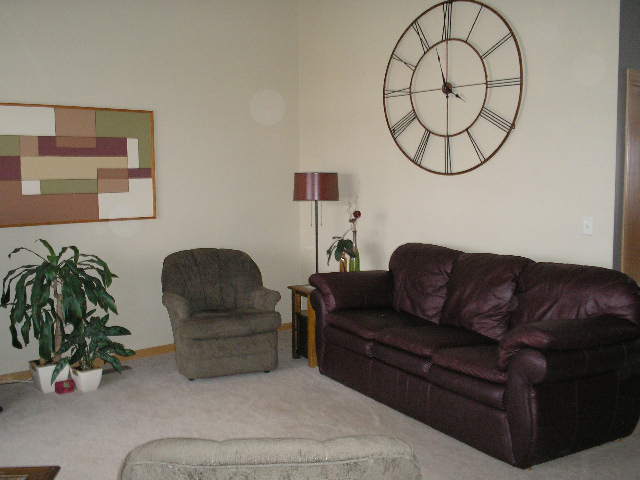
This angle is looking into our living room from the kitchen.
Our house is a basic one level. In Minnesota it’s called a rambler, but is also sometimes referred to as a ranch style. The main living areas of the house flow into each other, in a very open floor plan. This includes a living room, dining room and kitchen, and on into a family room.
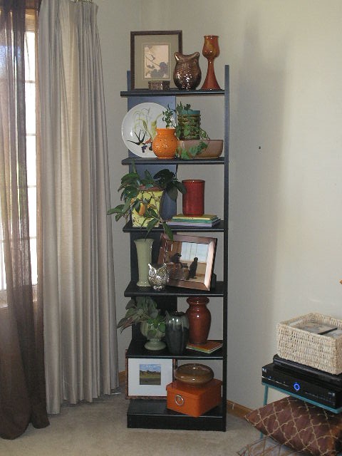
You’ve seen this shelf piece before. We purchased it several years ago at Crate and Barrel. Such a versatile unit, it can be on a flat wall, up against a corner wall or straddled across a corner as it is here. You can also pair it back to back with an identical shelf for a nice look. We’ve even used ours horizontally on the floor as well. The two glass owls in this display are from KOHL’s (a birthday gift). Except for the photography and plants here, everything else is from thrift stores or garage sales, and was purchased for next to nothing (including the Hull, Frankoma and noemi pottery pieces).
The blue metallic piece is simply a small table from an outdoor patio set. It holds our electronics and a little basket for movie storage. The open leg area makes a perfect spot for extra toss pillows too.
This is a small credenza piece, circa mid 1960’s. It was one in a set of three tables in my mom’s home; a brown, wood-look formica style popular at that time. I have redone this table three times. This treatment is my favorite as I used metallic copper paint to resurface the top and hardware, and added a light texture treatment to the paint in the body of the piece. Formica can be easily and economically redone. I love this credenza because its’unique shape and size can be used in so many places, and it was a special piece to my mom.
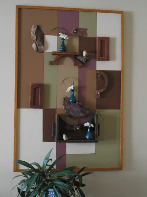
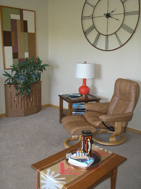
The art piece pictured here is something I painted several years ago. I just plotted out a geometric layout that I liked. It is painted on masonite, simply using latex wall paint. Then the blocks were outlined with a copper paint pen. Over time, as I change colors in my houses, these colors change as well. The piece is designed to hang either horizontally or vertically as featured here.
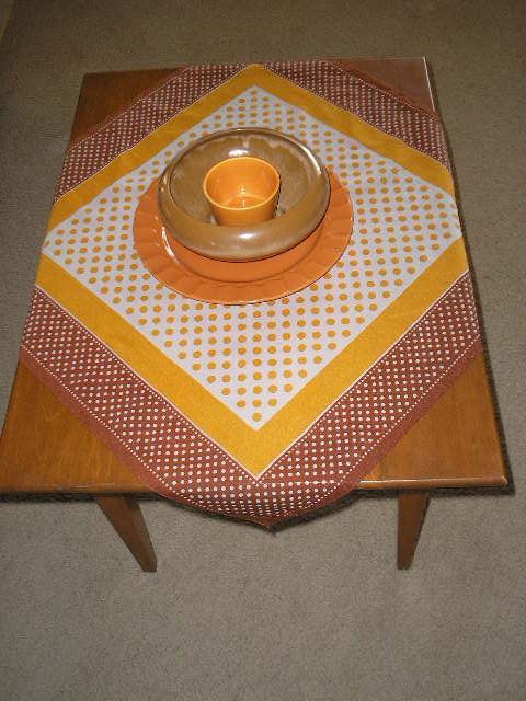
The orange lamp, petite coffee table and its’ accessories are all thrift store finds. $7.00 for the lamp (new with tags), $10.00 for the table and $.75 for the scarf (which is an original Vera Wang textile). The copper tray was under a dollar.
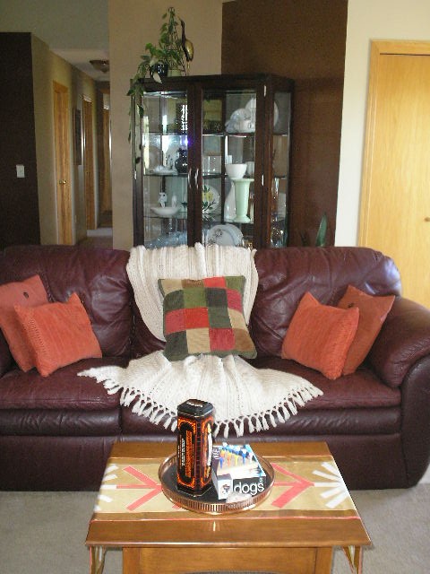
Our living room is wonderfully workable for several layouts. The couch out into the room as it is here, is one of our favorite arrangements. We also like our hutch across the angled walls as you see here.
The larger, square toss pillows are in indoor-outdoor fabric, and were purchased new at Wal-Mart for $4.64 each. I liked the design and durability, especially with our pets. The orange and patchwork corduroy pillows are part of a comforter set that I found at a garage sale recently. The material washed up quite nicely and is very durable. And by using some of the items in different rooms, it helps unite the spaces.
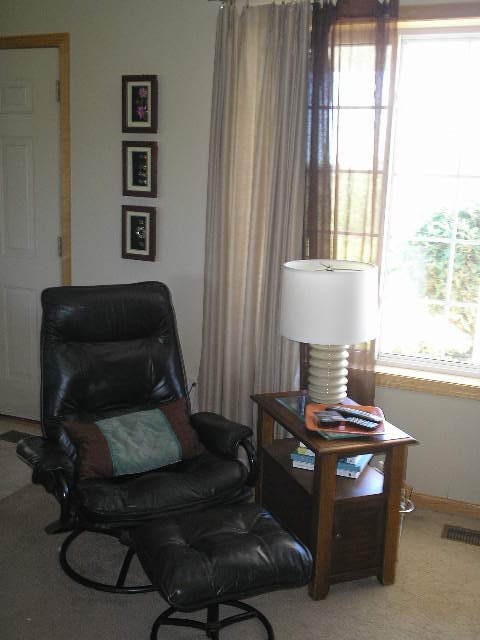
Finally pictured is Hubs’ favorite chair. Let it be known that a man is not easily separated from his electronics OR his favorite chair. I can hear someone saying “that looks like one of those vinyl sets you used to buy at big box stores”. Yes it does look like those, but it has a special story. In the late 1990’s I worked for Dayton’s, a wonderful upscale store in Minneapolis. At that time employees got fantastic discounts, and even more so twice a year during their “employee appreciation days”. Hubs fell in love with this chair, which was an exclusive design, in leather, imported from Italy. We had never seen anything like it. Even with my discounts, it was pretty spendy for us, but I wanted him to have the chair. Fortunately for some, but unfortunately for us, within a year’s time, there were vinyl knock-offs of this design in every big box store around, going for about $99. The only proof we have of its’ authenticity is that it is nearly 20 years old, and still looks and feels like new.
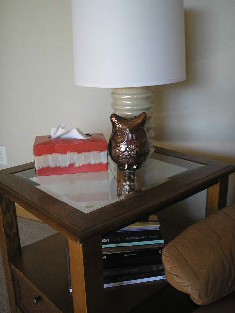
The three framed items were made with dollar store picture frames. I removed what was originally displayed, lined the back with black velvet, and then arranged several pieces of jewelry that had belonged to my mom, my aunt and my grandmother. The lamp is another thrift store purchase @ $5.00. TIPS: Always inspect wiring on these lamps; you don’t want dried out, or taped cords, or cracked cords or switches. Take a light bulb with you on your thrift trips, to test the lamp before you buy. REMEMBER, shades are easy to buy and or replace now days, so don’t pass up a great lamp base because of an ugly shade!
Thanks for stopping by today. Let your friends know we’re here. The more the merrier.
Later – Cheryl